Deelonderzoek toegankelijkheid module Regelcheck
Inleiding
Openbare voorzieningen moeten bruikbaar en toegankelijk zijn voor alle burgers. Net zoals een gebouw rolstoeltoegankelijk moet zijn, moet een website of mobiele app ook bediend kunnen worden door mensen met een beperking. Dit kunnen bijvoorbeeld visuele, auditieve of motorische beperkingen zijn. Denk aan slechtzienden, doven en slechthorenden en mensen die hun handen niet of in beperkte mate kunnen gebruiken. Ook cognitieve factoren spelen een rol: is de content voor iedereen te begrijpen?
Nederlandse overheidsorganisaties moeten voldoen aan de Web Content Accessibility Guidelines (WCAG) versie 2.1, onder de Europese standaard voor overheidswebsites EN 301 549. Deze criteria variëren van technisch functionele eisen zoals een goede werking met het toetsenbord tot aan meer inhoudelijke eisen zoals duidelijke foutmeldingen en een heldere navigatiestructuur.
Dit onderzoek is handmatig uitgevoerd volgens de WCAG-EM evaluatiemethode met ondersteuning van automatische test tools. De pagina’s uit de sample zijn onderzocht op alle 50 criteria onder WCAG 2.1 A en AA. Wanneer aan een criterium niet wordt voldaan, wordt hiervan minimaal één voorbeeld gegeven. Deze bevindingen kunnen op meer plekken voorkomen en moeten daarom structureel worden aangepakt.
De WCAG criteria zijn ingedeeld volgens vier principes, welke ook de leidraad vormen voor dit rapport: Waarneembaar, Bedienbaar, Begrijpelijk en Robuust. Gedetailleerde informatie over deze criteria is te vinden op de website van het W3C (Nederlandse vertaling).
Over deze evaluatie
- Rapport auteur
- Janita Top
- Evaluatie opdrachtgever
- Gemeente Eemsdelta
- Evaluatiedatum
- 4 september 2024
Managementsamenvatting
Uit dit onderzoek blijkt dat wordt voldaan aan 36 van de 50 criteria voor toegankelijkheid. Veel onderdelen van de site zijn dus al goed toegankelijk, maar er zijn nog verbeteringen mogelijk.
Positief is bijvoorbeeld dat er geen bewegende onderdelen worden gebruikt die niet gepauzeerd kunnen worden, dat er geen afbeeldingen van tekst worden gebruikt en dat de taal van de pagina goed is ingesteld.
Verbeteringen zijn echter nog mogelijk op diverse punten, zoals:
- Missende alt-teksten bij afbeeldingen
- Onjuist opgemaakte invoervelden
- Niet alle content is bereikbaar bij inzoomen
Scope van de evaluatie
- Website naam
- Module Regelcheck Potjeswijzer
- Scope van de website
- De module Regelcheck (proces met 4 stappen) op https://potjeswijzer.westerkwartier.nl/regelcheck. Niet de omliggende algemene onderdelen zoals header en footer van de webpagina.
- WCAG Versie
- 2.1
- Conformiteitsdoel
- AA
- Basisniveau van toegankelijkheid-ondersteuning
- Gangbare webbrowsers en hulpapparatuur.
- Verdere onderzoeksvereisten
Uitgebreide toetsresultaten
Samenvatting
Gerapporteerd over 50 van 50 WCAG 2.1 AA Success Criteria.
- 17 Voldoende
- 14 Onvoldoende
- 19 Niet van toepassing
- 0 Niet getoetst
Alle resultaten
1 Waarneembaar
1.1 Tekstalternatieven
| Success Criterium | Uitkomst | Bevindingen |
|---|---|---|
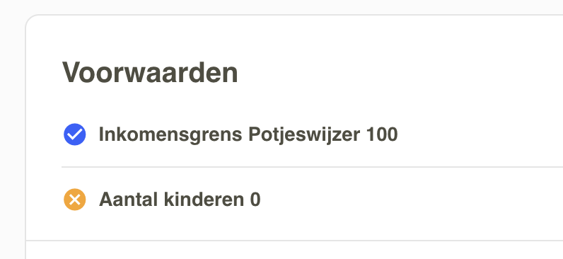
| 1.1.1: Niet-tekstuele content | Uitkomst: Onvoldoende | Bevindingen: In the last step, in each item below ‘Voorwaarden’ are icons which indicate if the condition is met or not. These icons are hidden from assistive software, but they give information to the user. See screenshot 4. Solution: remove the aria-hidden attribute and provide an alternative text within the element. |
1.2 Op tijd gebaseerde media
| Success Criterium | Uitkomst | Bevindingen |
|---|---|---|
| 1.2.1: Louter-geluid en louter-videobeeld (vooraf opgenomen) | Uitkomst: Niet van toepassing | |
| 1.2.2: Ondertitels voor doven en slechthorenden (vooraf opgenomen) | Uitkomst: Niet van toepassing | |
| 1.2.3: Audiodescriptie of media-alternatief (vooraf opgenomen) | Uitkomst: Niet van toepassing | |
| 1.2.4: Ondertitels voor doven en slechthorenden (live) | Uitkomst: Niet van toepassing | |
| 1.2.5: Audiodescriptie (vooraf opgenomen) | Uitkomst: Niet van toepassing |
1.3 Aanpasbaar
| Success Criterium | Uitkomst | Bevindingen |
|---|---|---|
| 1.3.1: Info en relaties | Uitkomst: Onvoldoende | Bevindingen: Headings on the page aren’t coded as heading elements but as div elements. Assistive software doesn’t recognize these texts as headings. For example: ‘Uw gegevens’, ‘De Regelcheck’ and ‘Gezinssituatie’. Solution: Mark up all styled headings in a heading element with a logical structure from h1 to h4/h5 without skipping any levels. Since this is a form, headings within the form like ‘Gezinssituatie’ and ‘Aantal volwassenen’ in step 1 can also be marked up as legend Below ‘Uw gegevens’ is visually a list with steps. It’s clear by a green color in which step you are. Within the steps are questions and answer pairs. All this structure information is not provided to assistive software. Solution: the code can be marked up as following:
In the last step, below ‘Fondsen’ is visually a list of items. In the code there are only div-elements. For assistive software it’s not clear that this is a list. Solution: code the items within a ul-element. In the last step, in each item is a heading ‘Voorwaarden’ which is not marked up as a heading element. Solution: code this text within a h3-element. |
| 1.3.2: Betekenisvolle volgorde | Uitkomst: Voldoende | |
| 1.3.3: Zintuiglijke eigenschappen | Uitkomst: Voldoende | |
| 1.3.4: Weergavestand | Uitkomst: Voldoende | |
| 1.3.5: Identificeer het doel van de input | Uitkomst: Niet van toepassing |
1.4 Onderscheidbaar
| Success Criterium | Uitkomst | Bevindingen |
|---|---|---|
| 1.4.1: Gebruik van kleur | Uitkomst: Onvoldoende | Bevindingen: Within the steps it’s made clear by color which is the current step. For people who can’t see this color, this information is not available. The contrast of this indicative green color is very low: 1.8:1. Solution: use another indication of the current step, like an icon or in text, and/or increase the contrast of the indicative color to at least 3:0. |
| 1.4.2: Geluidsbediening | Uitkomst: Niet van toepassing | |
| 1.4.3: Contrast (minimum) | Uitkomst: Onvoldoende | Bevindingen: Text must have a contrast of at least 4.5:1 for visually impaired and color blind people. This also applies to active elements such as hover and focus. The elements on the website mentioned below are below these values in terms of contrast. Solution: increase the contrast to at least 4.5:1. The green/white and green/gray combinations, for example:
|
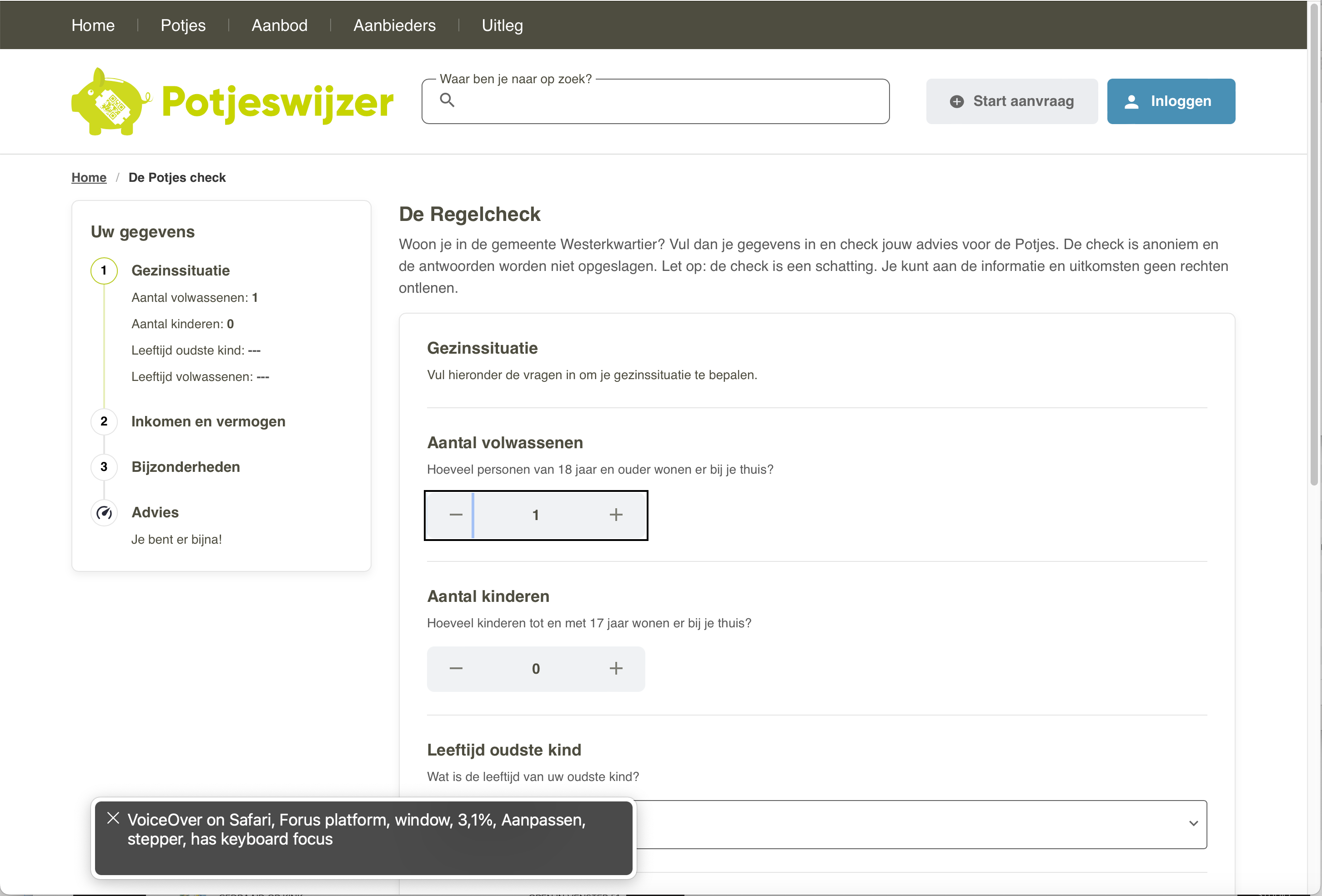
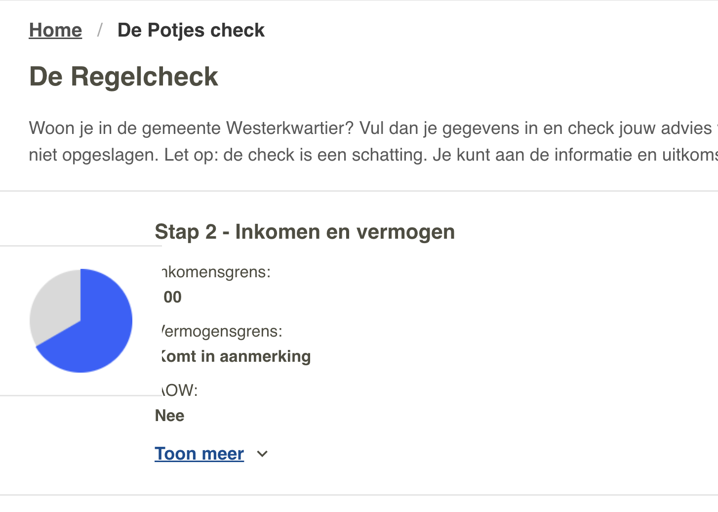
| 1.4.4: Herschalen van tekst | Uitkomst: Onvoldoende | Bevindingen: Make the layout responsive in such a way that all content remains available to at least 200% when zooming in. This is not the case in the following places on the site. Above 150% there is an image covering the text in the current step. See screenshot 3. Solution: remove the image or put it below the text. Above 150% the heading ‘Uw gegevens’ and the other steps are hidden. There is a ‘toon meer’ button but it doesn’t reveal anything. In the last step all information from the sidebar is hidden |
| 1.4.5: Afbeeldingen van tekst | Uitkomst: Voldoende | |
| 1.4.10: Reflow | Uitkomst: Onvoldoende | Bevindingen: Make the layout responsive in such a way that content can be presented without loss of information or functionality, and without requiring scrolling in two dimensions when zooming in to a minimum of 400% Above 200% there is an image covering the text in the current step. See screenshot 3. Solution: remove the image or put it below the text. Above 200% the heading ‘Uw gegevens’ and the other steps are hidden. There is a ‘toon meer’ button but it doesn’t reveal anything. In the last step all information from the sidebar is hidden |
| 1.4.11: Contrast van niet-tekstuele content | Uitkomst: Onvoldoende | Bevindingen: Graphic elements must have a contrast of at least 3:1. This also applies to the borders or background color of input fields. The elements on the website mentioned below are below these values in terms of contrast. Solution: increase the contrast to at least 3:1. In the last step: the icon which indicates that a condition is not met |
| 1.4.12: Tekstafstand | Uitkomst: Voldoende | |
| 1.4.13: Content bij hover of focus | Uitkomst: Niet van toepassing |
2 Bedienbaar
2.1 Toetsenbordtoegankelijk
| Success Criterium | Uitkomst | Bevindingen |
|---|---|---|
| 2.1.1: Toetsenbord | Uitkomst: Voldoende | |
| 2.1.2: Geen toetsenbordval | Uitkomst: Voldoende | |
| 2.1.4: Enkel teken sneltoetsen | Uitkomst: Niet van toepassing |
2.2 Genoeg tijd
| Success Criterium | Uitkomst | Bevindingen |
|---|---|---|
| 2.2.1: Timing aanpasbaar | Uitkomst: Niet van toepassing | |
| 2.2.2: Pauzeren, stoppen, verbergen | Uitkomst: Niet van toepassing |
2.3 Toevallen en fysieke reacties
| Success Criterium | Uitkomst | Bevindingen |
|---|---|---|
| 2.3.1: Drie flitsen of beneden drempelwaarde | Uitkomst: Voldoende |
2.4 Navigeerbaar
| Success Criterium | Uitkomst | Bevindingen |
|---|---|---|
| 2.4.1: Blokken omzeilen | Uitkomst: Niet van toepassing | |
| 2.4.2: Paginatitel | Uitkomst: Onvoldoende | Bevindingen: The page does not have a descriptive title, it’s called ‘Forus platform’. Solution: give the page a descriptive title like ‘Regelcheck Potjeswijzer’. To add the current step in the title will also be helpful. |
| 2.4.3: Focus volgorde | Uitkomst: Onvoldoende | Bevindingen: After going to the next step, focus stays on the ‘volgende’ button at the bottom of the form. This means a user has to navigate back up through the page to the top of the form. Solution: put the focus on the first input field from the top of the form. In the last step, focus goes to the list with results. After the results, focus goes into the footer. To get into the sidebar with options like Download and Edit, the user has to navigate back up through the list and then ‘back’ to the sidebar. This is very inconvenient for keyboard users. Solution: keep the visual order and focus order as much as possible in sync. When there are a lot of interactive elements, an extra skiplink can be provided to jump over the section, like ‘ga direct naar de resultaten’. |
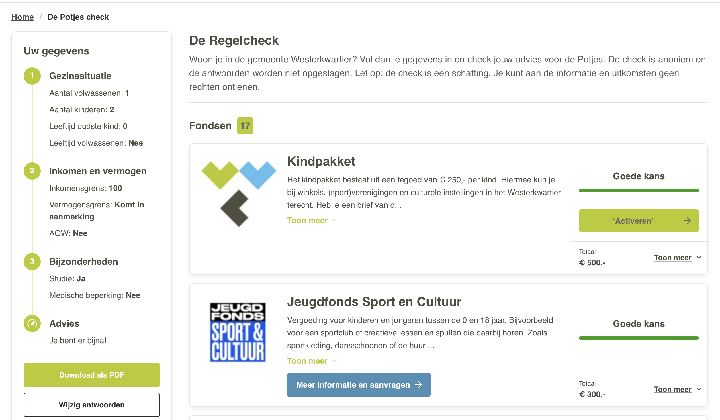
| 2.4.4: Linkdoel (in context) | Uitkomst: Onvoldoende | Bevindingen: In the last step, there are multiple links with the text ‘Meer informatie en aanvragen’. Users of assistive technology often request lists of links on the page. If these texts do not provide clear information, they cannot do anything with these links. Solution: Add texts to the link that make it clear what exactly it is about, so that the various links can be distinguished from each other. This can be done with an extra text in the link, possibly hidden with CSS, or via an aria-labelledby reference to a text elsewhere on the page, like the h2 heading of the item. For more information, see https://www.w3.org/TR/WCAG20-TECHS/ARIA7.html. |
| 2.4.5: Meerdere manieren | Uitkomst: Niet van toepassing | |
| 2.4.6: Koppen en labels | Uitkomst: Voldoende | |
| 2.4.7: Focus zichtbaar | Uitkomst: Onvoldoende | Bevindingen: The focus on the select lists |
2.5 Input Modaliteiten
| Success Criterium | Uitkomst | Bevindingen |
|---|---|---|
| 2.5.1: Aanwijzergebaren | Uitkomst: Niet van toepassing | |
| 2.5.2: Aanwijzerannulering | Uitkomst: Voldoende | |
| 2.5.3: Label in naam | Uitkomst: Voldoende | |
| 2.5.4: Bewegingsactivering | Uitkomst: Niet van toepassing |
3 Begrijpelijk
3.1 Leesbaar
| Success Criterium | Uitkomst | Bevindingen |
|---|---|---|
| 3.1.1: Taal van de pagina | Uitkomst: Voldoende | |
| 3.1.2: Taal van onderdelen | Uitkomst: Niet van toepassing |
3.2 Voorspelbaar
| Success Criterium | Uitkomst | Bevindingen |
|---|---|---|
| 3.2.1: Bij focus | Uitkomst: Voldoende | |
| 3.2.2: Bij input | Uitkomst: Voldoende | |
| 3.2.3: Consistente navigatie | Uitkomst: Voldoende | |
| 3.2.4: Consistente identificatie | Uitkomst: Voldoende |
3.3 Assistentie bij invoer
| Success Criterium | Uitkomst | Bevindingen |
|---|---|---|
| 3.3.1: Foutidentificatie | Uitkomst: Onvoldoende | Bevindingen: When submitting to the next step is not executed, there is no clear error identification. To state that a field is required is not an error message but an instruction. Solution: describe to the user in text which field is in error and how it can be corrected. For example: ‘Er is nog geen keuze gemaakt bij de inkomensgrens’. |
| 3.3.2: Labels of instructies | Uitkomst: Onvoldoende | Bevindingen: There is no instruction on which fields are required. This can cause unnecessary error messages and therefore an extra burden for users. Solution: Make clear in text before filling in the form which input fields are required |
| 3.3.3: Foutsuggestie | Uitkomst: Niet van toepassing | |
| 3.3.4: Foutpreventie (wettelijk, financieel, gegevens | Uitkomst: Niet van toepassing |
4 Robuust
4.1 Compatibel
| Success Criterium | Uitkomst | Bevindingen |
|---|---|---|
| 4.1.1: Parsen | Uitkomst: Voldoende | |
| 4.1.2: Naam, rol, waarde | Uitkomst: Onvoldoende | Bevindingen: In several steps are ‘steppers’ There are input fields which visually resemble a select with options, for example below ‘Leeftijd oudste kind’, but they are buttons that open a list box. The role and operation of this is not clear to users of assistance software. The listbox does not have an accessible name. Input fields are also nested. With the keyboard it does not work as expected with a listbox with the enter key to open the list and the arrow keys to navigate between the options. Solution: use the native select element to provide the options. This will be accessible to users of keyboard and assistive software by default. |
| 4.1.3: Statusberichten | Uitkomst: Niet van toepassing |
Sample met getoetste webpagina's
- Regelcheck - https://potjeswijzer.westerkwartier.nl/regelcheck
Webtechnologie
HTML,CSS,WAI-ARIA,JavaScript,SVG
Onderbouwing van de evaluatie
Gebruikte systemen tijdens het onderzoek:
- Chrome 128 en Safari 17.6 met Voiceover op Mac 13.6.9
- Chrome 128 op Android 14
- Edge 127 op Windows 10