Openbare voorzieningen moeten bruikbaar en toegankelijk zijn voor alle burgers. Net zoals een gebouw rolstoeltoegankelijk moet zijn, moet een website of mobiele app ook bediend kunnen worden door mensen met een beperking. Dit kunnen bijvoorbeeld visuele, auditieve of motorische beperkingen zijn. Denk aan slechtzienden, doven en slechthorenden en mensen die hun handen niet of in beperkte mate kunnen gebruiken. Ook cognitieve factoren spelen een rol: is de content voor iedereen te begrijpen?
Nederlandse overheidsorganisaties moeten voldoen aan de Web Content Accessibility Guidelines (WCAG) versie 2.1, onder de Europese standaard voor overheidswebsites EN 301 549. Deze criteria variëren van technisch functionele eisen zoals een goede werking met het toetsenbord tot aan meer inhoudelijke eisen zoals duidelijke foutmeldingen en een heldere navigatiestructuur.
Dit onderzoek is handmatig uitgevoerd volgens de WCAG-EM evaluatiemethode met ondersteuning van automatische test tools. De pagina’s uit de sample zijn onderzocht op alle 50 criteria onder WCAG 2.1 A en AA. Wanneer aan een criterium niet wordt voldaan, wordt hiervan minimaal één voorbeeld gegeven. Deze bevindingen kunnen op meer plekken voorkomen en moeten daarom structureel worden aangepakt.
De WCAG criteria zijn ingedeeld volgens vier principes, welke ook de leidraad vormen voor dit rapport: Waarneembaar, Bedienbaar, Begrijpelijk en Robuust. Gedetailleerde informatie over deze criteria is te vinden op de website van het W3C (Nederlandse vertaling).
Over deze evaluatie
Rapport auteur
Janita Top
Evaluatie opdrachtgever
Gemeente Eemsdelta
Evaluatiedatum
30 oktober 2024
Managementsamenvatting
Uit dit onderzoek blijkt dat wordt voldaan aan 35 van de 50 criteria voor toegankelijkheid. Veel onderdelen van de app zijn dus al goed toegankelijk, maar er zijn nog verbeteringen mogelijk.
Positief is bijvoorbeeld dat er geen afbeeldingen van tekst worden gebruikt en dat er geen bewegende onderdelen in de app zitten die niet kunnen worden gepauzeerd.
Verbeteringen zijn echter nog mogelijk op diverse punten, zoals:
Knoppen hebben Engelse labels in de Nederlandse app
De tekst in de app kan niet vergroot worden
Niet alle functionaliteit werkt met het toetsenbord en/of screenreader
Scope van de evaluatie
Website naam
Me - Forus mobiele app iOS
Scope van de website
Alle schermen in de iOS app. App versie 0.4.18 (test-app via TestFlight).
WCAG Versie
2.1
Conformiteitsdoel
AA
Basisniveau van toegankelijkheid-ondersteuning
Gangbare webbrowsers en hulpapparatuur.
Verdere onderzoeksvereisten
Uitgebreide toetsresultaten
Samenvatting
Gerapporteerd over 50 van 50 WCAG 2.1 AA
Success Criteria.
13Voldoende
15Onvoldoende
22Niet van toepassing
0Niet getoetst
Alle resultaten
1 Waarneembaar
1.1 Tekstalternatieven
Success Criterium
Uitkomst
Bevindingen
1.1.1: Niet-tekstuele content
Hele sample
Uitkomst: Onvoldoende
Geldig tegoed QR tonen
Uitkomst: Onvoldoende
Geldig tegoed QR tonen
The image of the QR code has no alternative text. A screen reader user does not know where it is when they want to show it to a provider.
1.2 Op tijd gebaseerde media
Success Criterium
Uitkomst
Bevindingen
1.2.1: Louter-geluid en louter-videobeeld (vooraf opgenomen)
Hele sample
Uitkomst: Niet van toepassing
1.2.2: Ondertitels voor doven en slechthorenden (vooraf opgenomen)
Hele sample
Uitkomst: Niet van toepassing
1.2.3: Audiodescriptie of media-alternatief (vooraf opgenomen)
Hele sample
Uitkomst: Niet van toepassing
1.2.4: Ondertitels voor doven en slechthorenden (live)
Hele sample
Uitkomst: Niet van toepassing
1.2.5: Audiodescriptie (vooraf opgenomen)
Hele sample
Uitkomst: Niet van toepassing
1.3 Aanpasbaar
Success Criterium
Uitkomst
Bevindingen
1.3.1: Info en relaties
Hele sample
Uitkomst: Onvoldoende
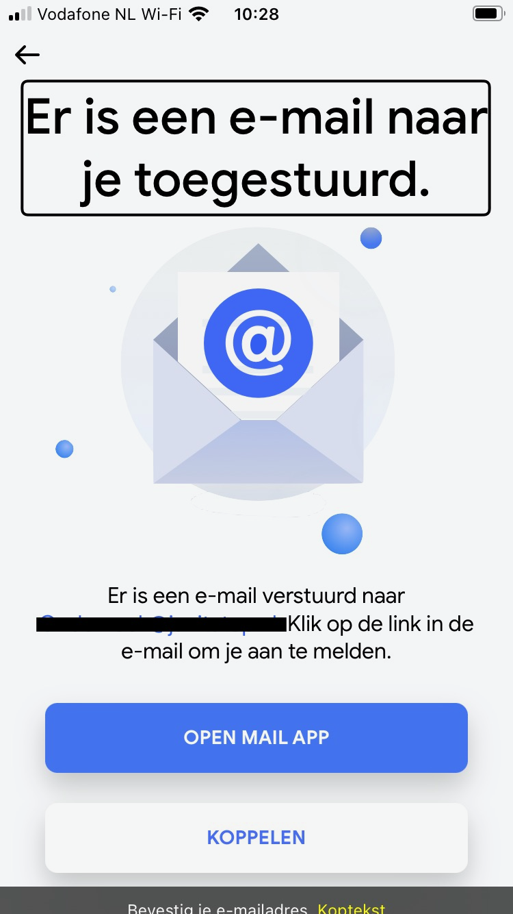
Inlogscherm stap 2 Controleer je e-mail
Uitkomst: Onvoldoende
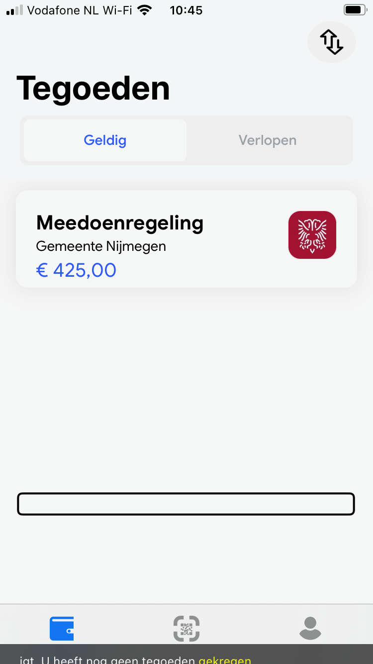
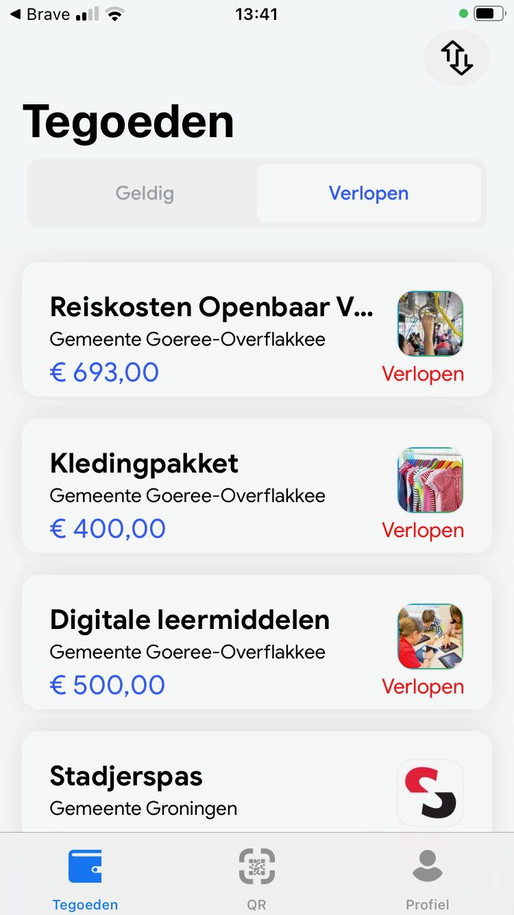
Tegoeden overzicht -tabblad geldig
Uitkomst: Onvoldoende
Inlogscherm stap 2 Controleer je e-mail
Visually, there is a heading saying “Er is een e-mail naar je toegestuurd.” However, the screen reader reads the heading as “Bevestig je e-mailadres.” See screenshot 1. This is confusing for visually impaired screen reader users who encounter different headings, and for blind screen reader users who receive different information than sighted users. Ensure these headings match.
Tegoeden overzicht -tabblad geldig
Under credits, there is a valid balance of €425. However, with the screen reader, I hear the message, “U heeft nog geen tegoeden gekregen” See screenshot 3. This text should likely be hidden from assistive software as well.
At the top of the screen, there are two tabs: “Geldig” and “Verlopen.” One of them is active, but this status is not communicated to assistive software. See also 4.1.2.
1.3.2: Betekenisvolle volgorde
Hele sample
Uitkomst: Voldoende
1.3.3: Zintuiglijke eigenschappen
Hele sample
Uitkomst: Onvoldoende
Hele sample
Bevindingen:
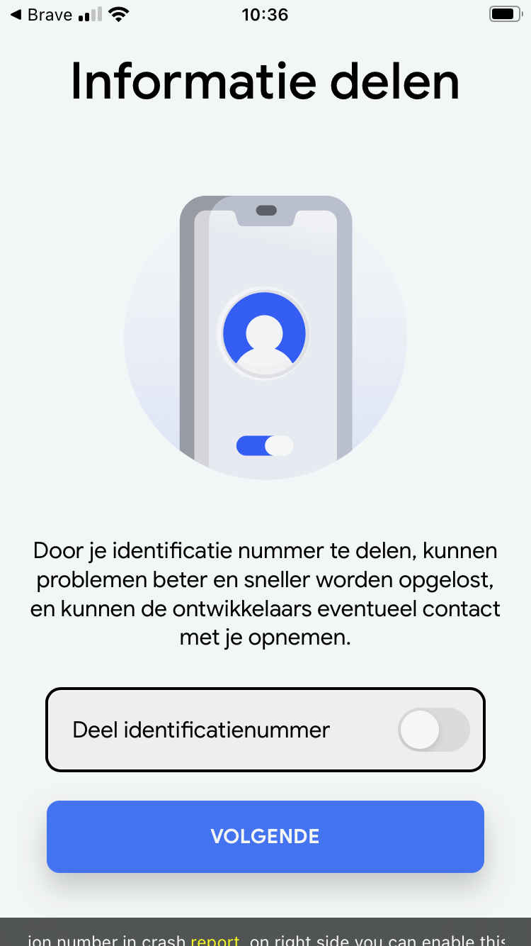
The switches in the app have the instruction “view on right side you can enable this option.” This is not perceivable for everyone. Create an instruction without referencing the layout.
1.3.4: Weergavestand
Hele sample
Uitkomst: Onvoldoende
Hele sample
Bevindingen:
The app can only be used in portrait mode. People with motor disabilities cannot always turn the device. Therefore, make sure that everything is always accessible in portrait and landscape mode.
1.3.5: Identificeer het doel van de input
Hele sample
Uitkomst: Onvoldoende
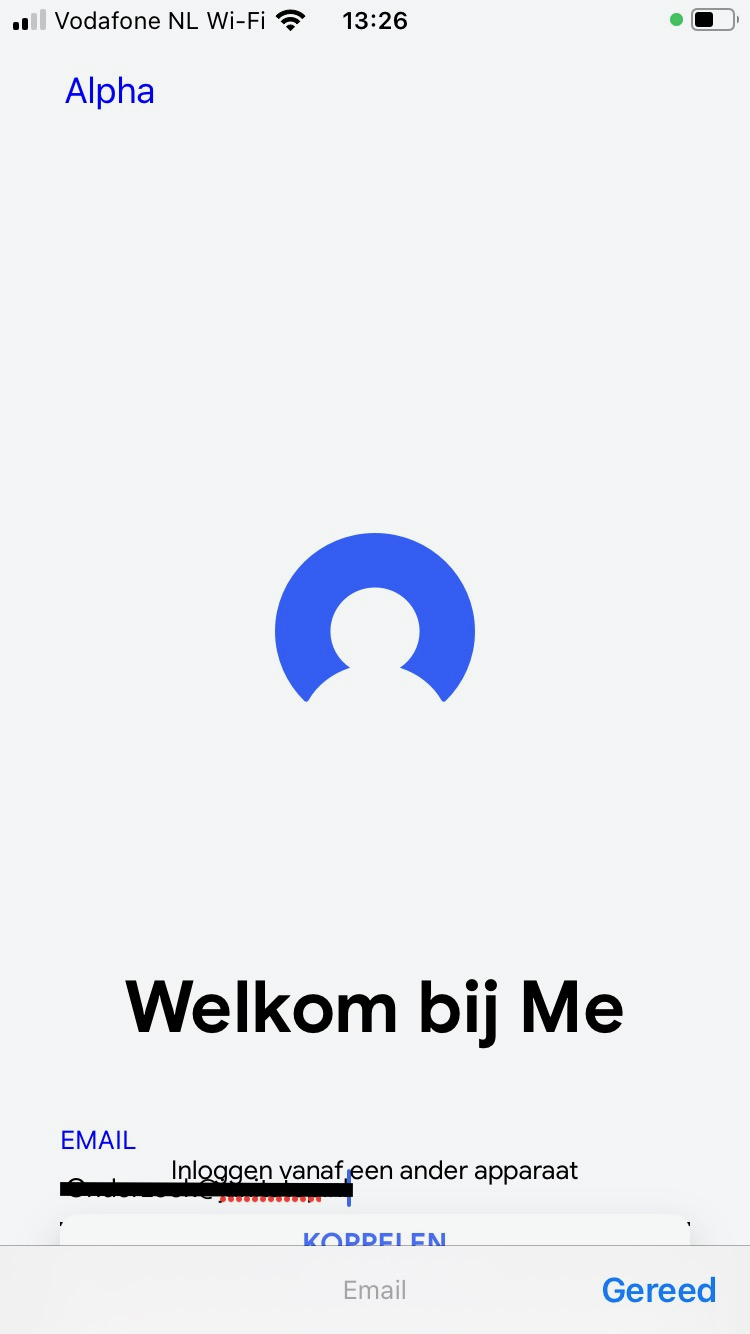
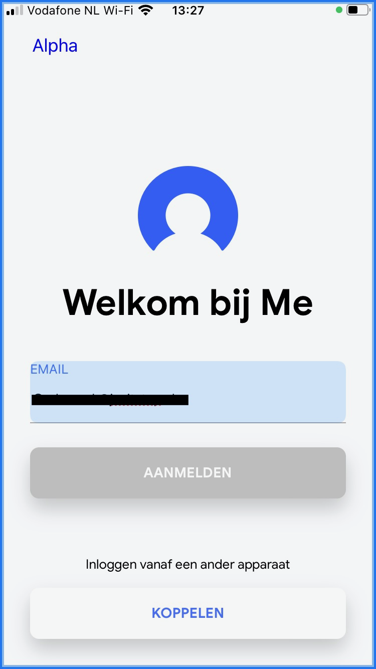
Inlogscherm Welkom
Uitkomst: Onvoldoende
Hele sample
Bevindingen:
Inlogscherm Welkom
The email address in the login screen cannot be auto-filled (no options appear under the field). Auto-fill makes form completion easier for many users, such as those for whom entering text takes more time due to the use of assistive tools, or for people with cognitive impairments.
1.4 Onderscheidbaar
Success Criterium
Uitkomst
Bevindingen
1.4.1: Gebruik van kleur
Hele sample
Uitkomst: Voldoende
1.4.2: Geluidsbediening
Hele sample
Uitkomst: Niet van toepassing
1.4.3: Contrast (minimum)
Hele sample
Uitkomst: Onvoldoende
Inlogscherm Welkom
Uitkomst: Onvoldoende
Tegoeden overzicht -tabblad geldig
Uitkomst: Onvoldoende
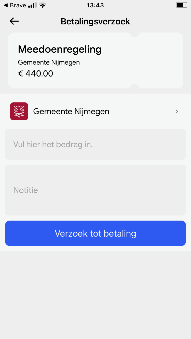
Verzoek betaling
Uitkomst: Onvoldoende
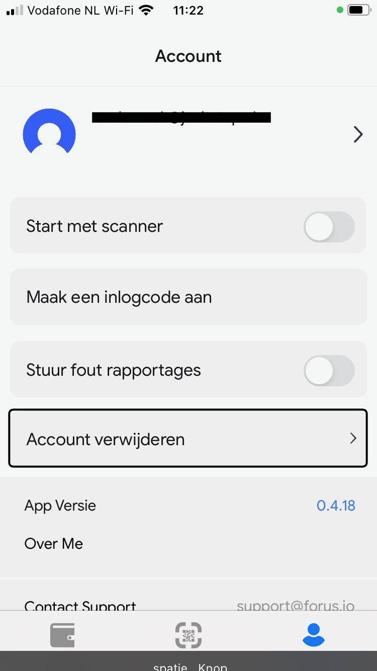
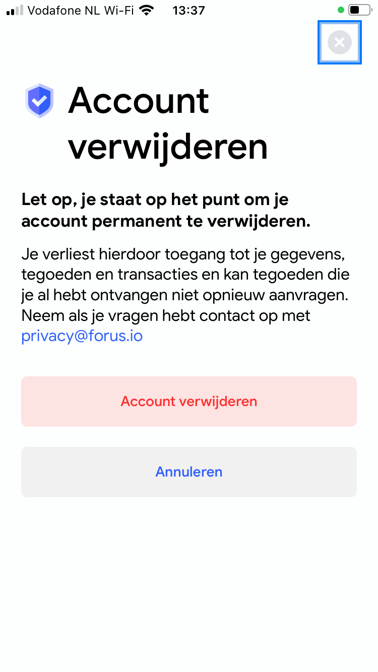
Account Instellingen
Uitkomst: Onvoldoende
Hele sample
Bevindingen:
Text must have a contrast of at least 4.5:1 for the visually impaired and color blind. This also applies to active elements such as on hover and focus. The following elements are below these values in terms of contrast.
Inlogscherm Welkom
The label near the email input (gray/gray, 1.7:1).
Tegoeden overzicht -tabblad geldig
The text of the main tabs like ‘Tegoeden’ and ‘QR’ (gray/gray, 2.5:1).
The text ‘verlopen’ (red/gray, 4:1). See screenshot 11.
Verzoek betaling
The labels near the inputs (gray/gray, 2.5:1). See screenshot 10.
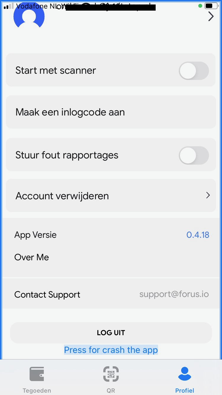
Account Instellingen
The email address for support (gray/gray, 2.7:1). See screenshot 8.
The button text ‘account verwijderen’ (red/pink, 3.2:1). See screenshot 12.
1.4.4: Herschalen van tekst
Hele sample
Uitkomst: Onvoldoende
Hele sample
Bevindingen:
Visually impaired users often set a larger font on their phone, so that the texts are easier to read. Make sure that all text in the app can be displayed enlarged. In addition, enlarged text may not be shortened, overlap other text or no longer be visible. This function does not work well in the app. When resizing the font, almost all text in the app stays in the small, default size.
1.4.5: Afbeeldingen van tekst
Hele sample
Uitkomst: Voldoende
1.4.10: Reflow
Hele sample
Uitkomst: Onvoldoende
Hele sample
Bevindingen:
It is not possible to enlarge the text in the app, making it impossible to properly assess this criterion.
1.4.11: Contrast van niet-tekstuele content
Hele sample
Uitkomst: Onvoldoende
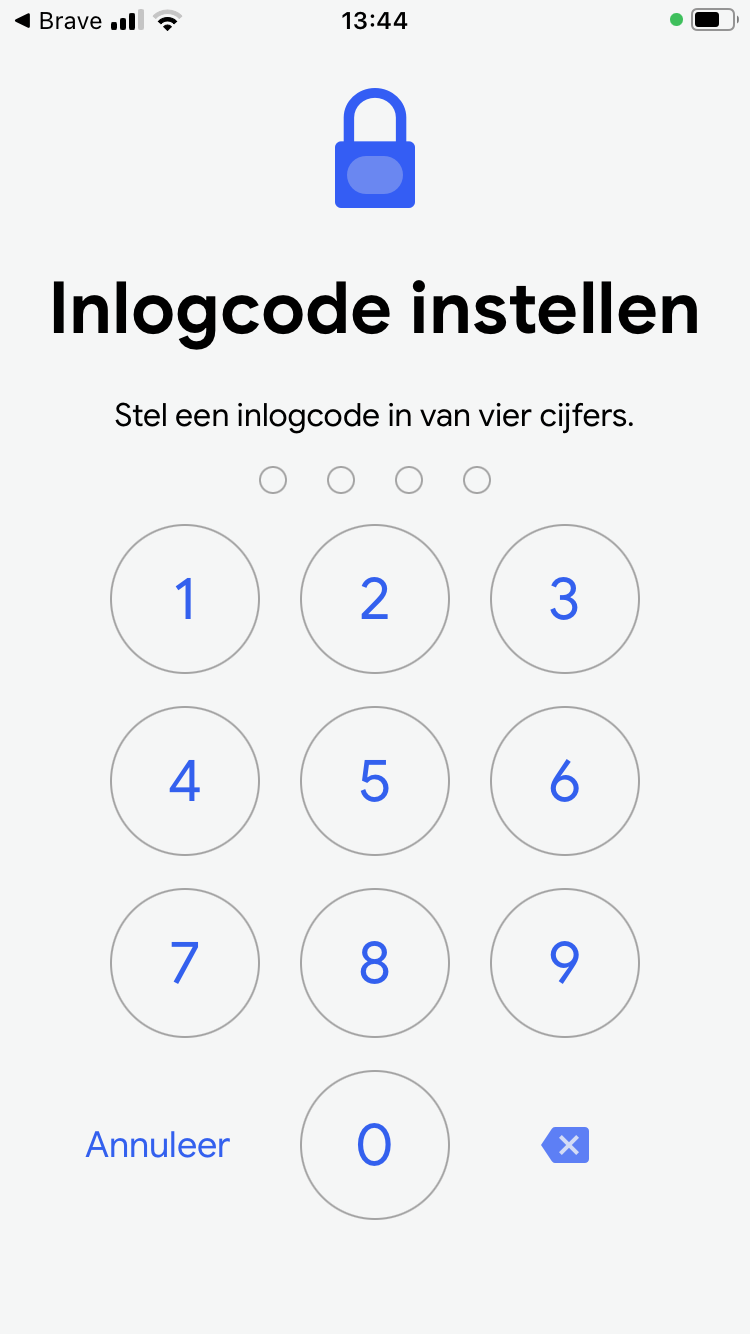
Inlogcode aanzetten
Uitkomst: Onvoldoende
Hele sample
Bevindingen:
Graphic elements must have a contrast of at least 3:1. This also applies to the borders or background color of input fields. The elements below are below these values in terms of contrast.
The buttons to close a popup (cross icon, gray/gray, 1.3:1). See screenshot 7.
The switches to toggle options (gray/gray, 1.3:1). See screenshot 8.
Inlogcode aanzetten
The button to erase a number (blue/blue, 2.6:1). See screenshot 9.
1.4.12: Tekstafstand
Hele sample
Uitkomst: Voldoende
1.4.13: Content bij hover of focus
Hele sample
Uitkomst: Niet van toepassing
2 Bedienbaar
2.1 Toetsenbordtoegankelijk
Success Criterium
Uitkomst
Bevindingen
2.1.1: Toetsenbord
Hele sample
Uitkomst: Onvoldoende
Inlogscherm Welkom
Uitkomst: Voldoende
Tegoeden overzicht -tabblad geldig
Uitkomst: Onvoldoende
Inlogscherm Welkom
Note: Logging in with a keyboard is very difficult. Entering the email address is challenging (see screenshot 5), and afterward, the sign-in button remains disabled for a while. See screenshot 6.
Tegoeden overzicht -tabblad geldig
It is not possible to switch between the “Geldig” and “Verlopen” tabs using the keyboard.
2.1.2: Geen toetsenbordval
Hele sample
Uitkomst: Voldoende
2.1.4: Enkel teken sneltoetsen
Hele sample
Uitkomst: Niet van toepassing
2.2 Genoeg tijd
Success Criterium
Uitkomst
Bevindingen
2.2.1: Timing aanpasbaar
Hele sample
Uitkomst: Niet van toepassing
2.2.2: Pauzeren, stoppen, verbergen
Hele sample
Uitkomst: Niet van toepassing
2.3 Toevallen en fysieke reacties
Success Criterium
Uitkomst
Bevindingen
2.3.1: Drie flitsen of beneden drempelwaarde
Hele sample
Uitkomst: Voldoende
2.4 Navigeerbaar
Success Criterium
Uitkomst
Bevindingen
2.4.1: Blokken omzeilen
Hele sample
Uitkomst: Niet van toepassing
2.4.2: Paginatitel
Hele sample
Uitkomst: Niet van toepassing
2.4.3: Focus volgorde
Hele sample
Uitkomst: Onvoldoende
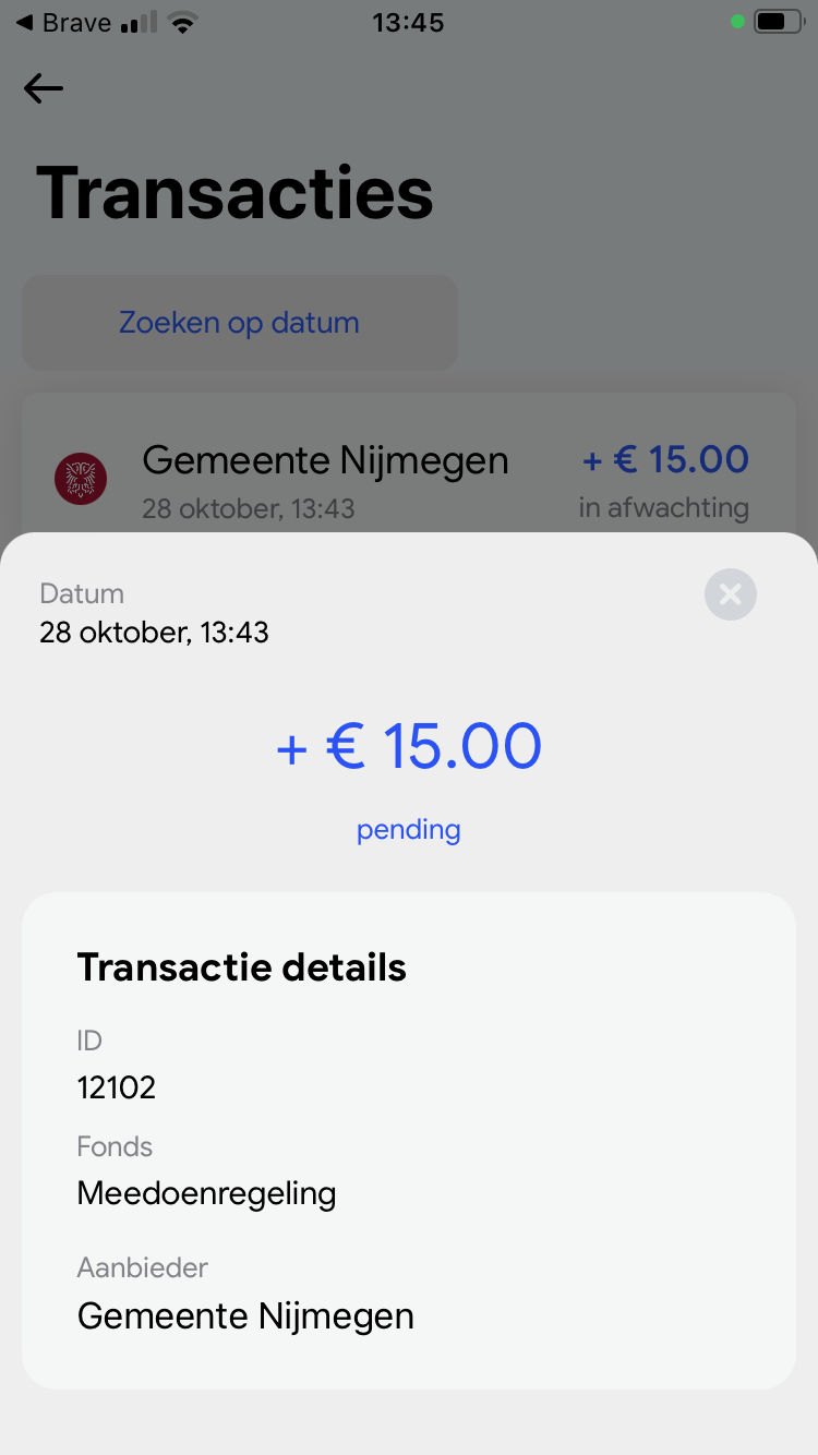
Transacties
Uitkomst: Onvoldoende
Transacties
When you click “zoeken op datum,” a popup opens. However, the focus does not move into the popup and remains on the screen underneath. Ensure that when the popup is open, the focus remains within it to allow a date to be selected, and only returns to the underlying screen after choosing a date or pressing the escape key. This also applies to the popup with transaction details. You can access the details with a screen reader, but the close button does not work, and the focus can still shift to the underlying screen.
2.4.4: Linkdoel (in context)
Hele sample
Uitkomst: Voldoende
2.4.5: Meerdere manieren
Hele sample
Uitkomst: Niet van toepassing
2.4.6: Koppen en labels
Hele sample
Uitkomst: Onvoldoende
Hele sample
Bevindingen:
Many labels are in English, while the app is in Dutch. This can be confusing for users. For example, on the login screen, the button reads “Open mail app to confirm registration” (only the first three words are visible, but the screen reader reads them all aloud). And on a switch: “Turn on schuine streep off to send identification number…” Ensure that all labels in the Dutch version of the app are also in Dutch.
2.4.7: Focus zichtbaar
Hele sample
Uitkomst: Voldoende
2.5 Input Modaliteiten
Success Criterium
Uitkomst
Bevindingen
2.5.1: Aanwijzergebaren
Hele sample
Uitkomst: Niet van toepassing
2.5.2: Aanwijzerannulering
Hele sample
Uitkomst: Voldoende
2.5.3: Label in naam
Hele sample
Uitkomst: Onvoldoende
Hele sample
Bevindingen:
Several components have a visual label that is different from the accessible label, such as for the screen reader. For example, the ‘Aanmelden’ button has the label ‘Bevestigen’. The ‘Koppelen’ button has the label ‘Show or Code and Pin Code’. This label is also confusing because the text is in English and does not clearly indicate an action. The button for transactions is called ‘transaction icon’. This appears in many places in the app. When buttons or links have a different accessible name than what is visible, they cannot be operated by voice. Make sure that the accessible name (such as alternative text and labels) always contains at least the visible text.
2.5.4: Bewegingsactivering
Hele sample
Uitkomst: Niet van toepassing
3 Begrijpelijk
3.1 Leesbaar
Success Criterium
Uitkomst
Bevindingen
3.1.1: Taal van de pagina
Hele sample
Uitkomst: Voldoende
3.1.2: Taal van onderdelen
Hele sample
Uitkomst: Niet van toepassing
3.2 Voorspelbaar
Success Criterium
Uitkomst
Bevindingen
3.2.1: Bij focus
Hele sample
Uitkomst: Voldoende
3.2.2: Bij input
Hele sample
Uitkomst: Voldoende
3.2.3: Consistente navigatie
Hele sample
Uitkomst: Niet van toepassing
3.2.4: Consistente identificatie
Hele sample
Uitkomst: Niet van toepassing
3.3 Assistentie bij invoer
Success Criterium
Uitkomst
Bevindingen
3.3.1: Foutidentificatie
Hele sample
Uitkomst: Onvoldoende
Inlogscherm Welkom
Uitkomst: Onvoldoende
Inlogscherm Welkom
When the email address is entered incorrectly, the button to submit stays disabled, but there is no error message. For some users it can be unclear why they can’t submit. Provide a clear message about the input error.
The switch to share information (the identification number) cannot be turned on with VoiceOver. There is an instruction ‘view on right side you can enable this option’. See screenshot 2. A screen reader user cannot do anything with this. It is better to give it a short, clear label (in Dutch) and make it activatable via space or enter. Then you can double-tap with a screen reader to activate.
Tegoeden overzicht -tabblad geldig
At the top of the screen are 2 tabs: ‘Geldig’ en ‘Verlopen’. One of them is activated. This is not passed on to assistive software. The role and status of these elements should be clearly indicated, for example ‘Geldig tab, selected’.
The credit has no clear role as a link or button, so it is now unclear whether it can be opened to show more details such as the QR code.
Account Instellingen
There are several switches on the account page similar to the switch to share information in the login process. It is here also not clear to a screen reader user that these are toggle buttons and whether they are on or off. Give these elements a clear name (label), role (switch) and value (on/off). Make sure that they can also be turned on/off with assistive software.
The button to delete the account is only called ‘space’. See screenshot 4.