Openbare voorzieningen moeten bruikbaar en toegankelijk zijn voor alle burgers. Net zoals een gebouw rolstoeltoegankelijk moet zijn, moet een website of mobiele app ook bediend kunnen worden door mensen met een beperking. Dit kunnen bijvoorbeeld visuele, auditieve of motorische beperkingen zijn. Denk aan slechtzienden, doven en slechthorenden en mensen die hun handen niet of in beperkte mate kunnen gebruiken. Ook cognitieve factoren spelen een rol: is de content voor iedereen te begrijpen?
Nederlandse overheidsorganisaties moeten voldoen aan de Web Content Accessibility Guidelines (WCAG) versie 2.1, onder de Europese standaard voor overheidswebsites EN 301 549. Deze criteria variëren van technisch functionele eisen zoals een goede werking met het toetsenbord tot aan meer inhoudelijke eisen zoals duidelijke foutmeldingen en een heldere navigatiestructuur.
Dit onderzoek is handmatig uitgevoerd volgens de WCAG-EM evaluatiemethode met ondersteuning van automatische test tools. De pagina’s uit de sample zijn onderzocht op alle 50 criteria onder WCAG 2.1 A en AA. Wanneer aan een criterium niet wordt voldaan, wordt hiervan minimaal één voorbeeld gegeven. Deze bevindingen kunnen op meer plekken voorkomen en moeten daarom structureel worden aangepakt.
De WCAG criteria zijn ingedeeld volgens vier principes, welke ook de leidraad vormen voor dit rapport: Waarneembaar, Bedienbaar, Begrijpelijk en Robuust. Gedetailleerde informatie over deze criteria is te vinden op de website van het W3C (Nederlandse vertaling).
Over deze evaluatie
Rapport auteur
Janita Top
Evaluatie opdrachtgever
Gemeente Eemsdelta
Evaluatiedatum
28 oktober 2024
Managementsamenvatting
Uit dit onderzoek blijkt dat wordt voldaan aan 40 van de 50 criteria voor toegankelijkheid. Veel onderdelen van de app zijn dus al goed toegankelijk, maar er zijn nog verbeteringen mogelijk.
Positief is bijvoorbeeld dat er geen zintuiglijke eigenschappen worden gebruikt om betekenis over te brengen, dat er geen afbeeldingen van tekst worden gebruikt en er geen bewegende onderdelen in de app zitten die niet kunnen worden gepauzeerd.
Verbeteringen zijn echter nog mogelijk op diverse punten, zoals:
Onjuist opgemaakte koppen
Knoppen zonder labels
Niet alle content is leesbaar bij vergrote tekst
Niet alle content is bereikbaar met het toetsenbord
Scope van de evaluatie
Website naam
Me - Forus mobiele app Android
Scope van de website
Alle schermen in de Android app.
App versie 0.5.2-demo-1.
WCAG Versie
2.1
Conformiteitsdoel
AA
Basisniveau van toegankelijkheid-ondersteuning
Gangbare webbrowsers en hulpapparatuur.
Verdere onderzoeksvereisten
Uitgebreide toetsresultaten
Samenvatting
Gerapporteerd over 50 van 50 WCAG 2.1 AA
Success Criteria.
17Voldoende
10Onvoldoende
23Niet van toepassing
0Niet getoetst
Alle resultaten
1 Waarneembaar
1.1 Tekstalternatieven
Success Criterium
Uitkomst
Bevindingen
1.1.1: Niet-tekstuele content
Hele sample
Uitkomst: Onvoldoende
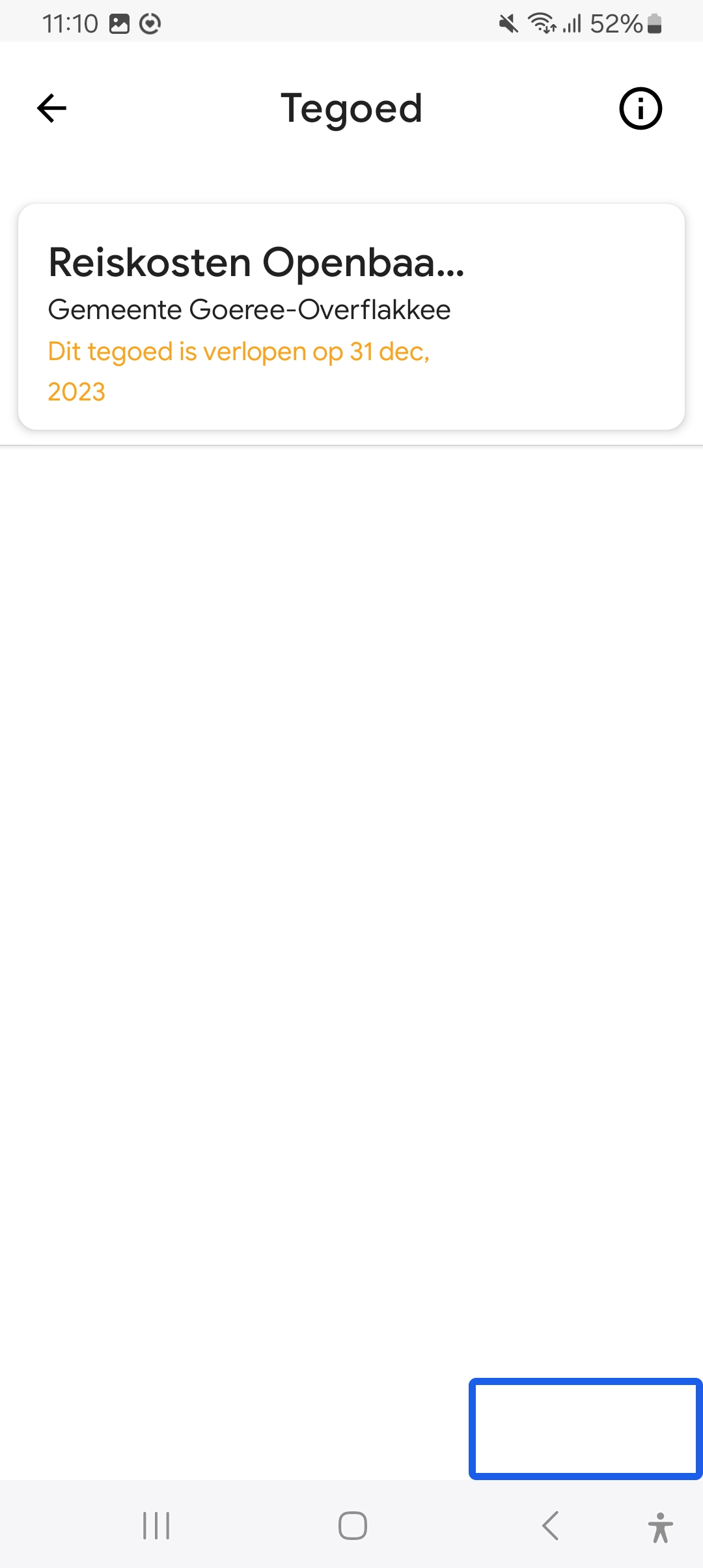
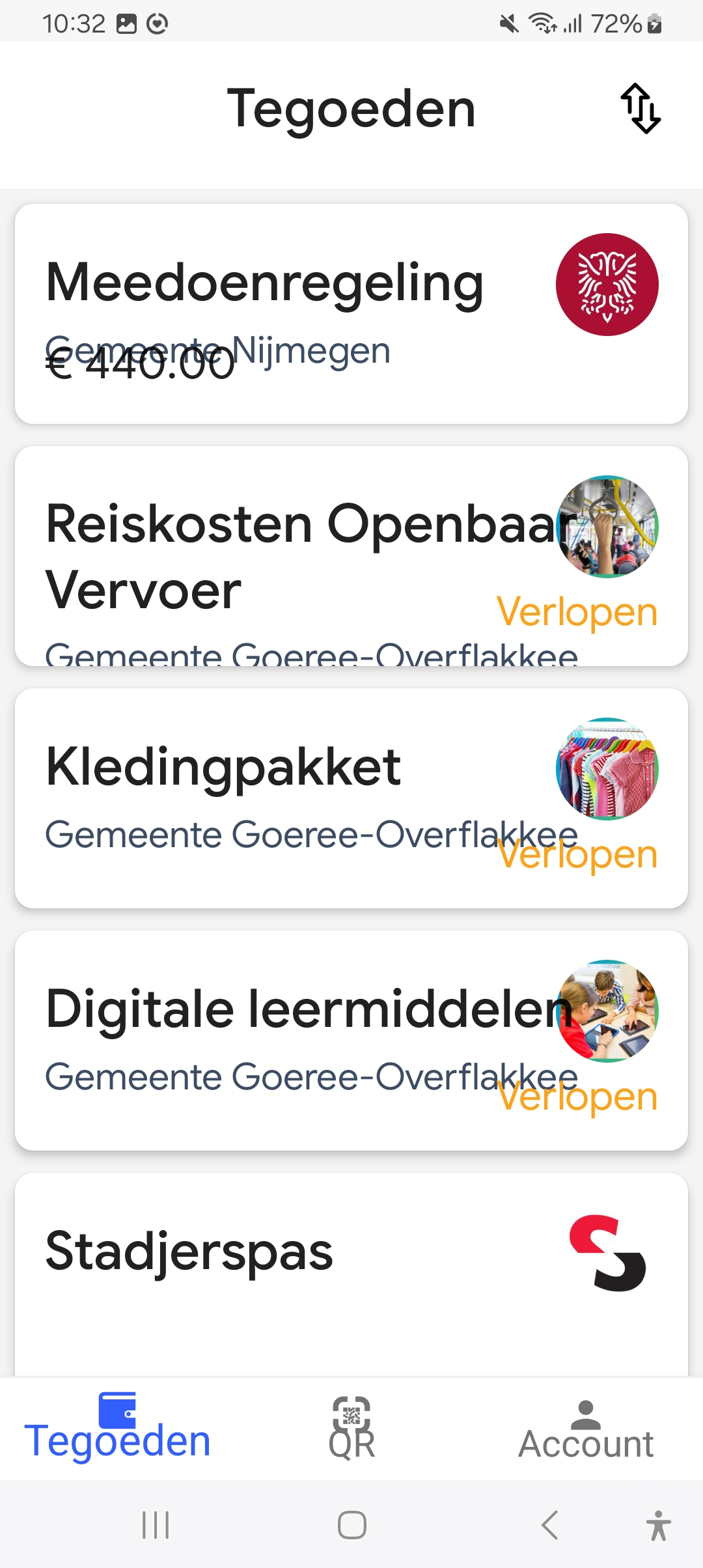
Tegoeden overzicht
Uitkomst: Onvoldoende
Tegoeden overzicht
The icon for transactions is named ‘omhoog’. This is not clear. Change it to for example ‘Transacties’. See also 4.1.2.
1.2 Op tijd gebaseerde media
Success Criterium
Uitkomst
Bevindingen
1.2.1: Louter-geluid en louter-videobeeld (vooraf opgenomen)
Hele sample
Uitkomst: Niet van toepassing
1.2.2: Ondertitels voor doven en slechthorenden (vooraf opgenomen)
Hele sample
Uitkomst: Niet van toepassing
1.2.3: Audiodescriptie of media-alternatief (vooraf opgenomen)
Hele sample
Uitkomst: Niet van toepassing
1.2.4: Ondertitels voor doven en slechthorenden (live)
Hele sample
Uitkomst: Niet van toepassing
1.2.5: Audiodescriptie (vooraf opgenomen)
Hele sample
Uitkomst: Niet van toepassing
1.3 Aanpasbaar
Success Criterium
Uitkomst
Bevindingen
1.3.1: Info en relaties
Hele sample
Uitkomst: Onvoldoende
Tegoeden overzicht
Uitkomst: Onvoldoende
Geldig tegoed QR tonen
Uitkomst: Onvoldoende
Instellingen
Uitkomst: Onvoldoende
Tegoeden overzicht
At the bottom of the screen is a menu, where the active item has a different color. This status is not passed on to assistive software. It is not clear now that there are 3 tabs and which one is active.
Geldig tegoed QR tonen
The content of this screen is not available for assistive software. Visually it shows the selected credit, but with assistive software you are still on the underlying list. See screenshot 1.
Instellingen
This page contains multiple headings that are not indicated as headings. These are Account, Instellingen and Informatie. Visually this shows the structure of the page, for a screen reader user this is now missing. Add headings here.
1.3.2: Betekenisvolle volgorde
Hele sample
Uitkomst: Voldoende
1.3.3: Zintuiglijke eigenschappen
Hele sample
Uitkomst: Voldoende
1.3.4: Weergavestand
Hele sample
Uitkomst: Onvoldoende
Hele sample
Bevindingen:
The app can only be used in portrait mode. People with motor disabilities cannot always turn the device. Therefore, make sure that everything is always accessible in portrait and landscape mode.
1.3.5: Identificeer het doel van de input
Hele sample
Uitkomst: Voldoende
1.4 Onderscheidbaar
Success Criterium
Uitkomst
Bevindingen
1.4.1: Gebruik van kleur
Hele sample
Uitkomst: Voldoende
1.4.2: Geluidsbediening
Hele sample
Uitkomst: Niet van toepassing
1.4.3: Contrast (minimum)
Hele sample
Uitkomst: Onvoldoende
Tegoeden overzicht
Uitkomst: Onvoldoende
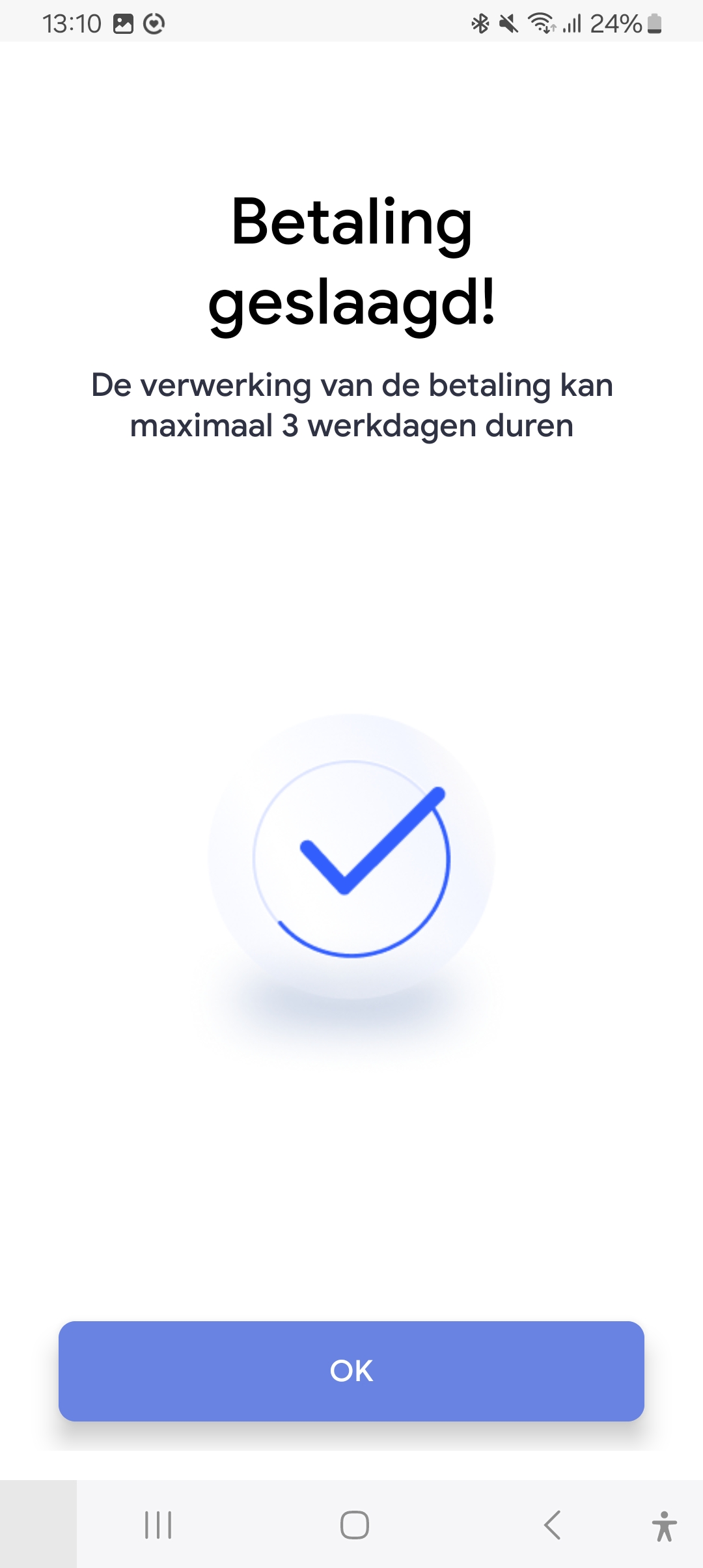
Verzoek betaling
Uitkomst: Onvoldoende
Hele sample
Bevindingen:
Text must have a contrast of at least 4.5:1 for the visually impaired and color blind. This also applies to active elements such as on hover and focus. The following elements on the website are below these values in terms of contrast.
Tegoeden overzicht
The text ‘verlopen’ (orange/white, 2:1). See screenshot 3.
Verzoek betaling
The ‘OK’ button after payment is successful (3.5:1). See screenshot 2.
1.4.4: Herschalen van tekst
Hele sample
Uitkomst: Onvoldoende
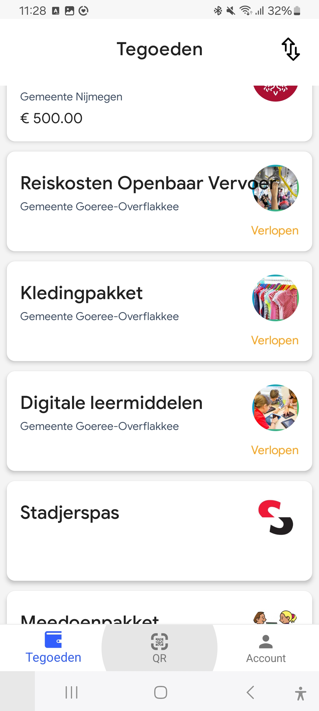
Tegoeden overzicht
Uitkomst: Onvoldoende
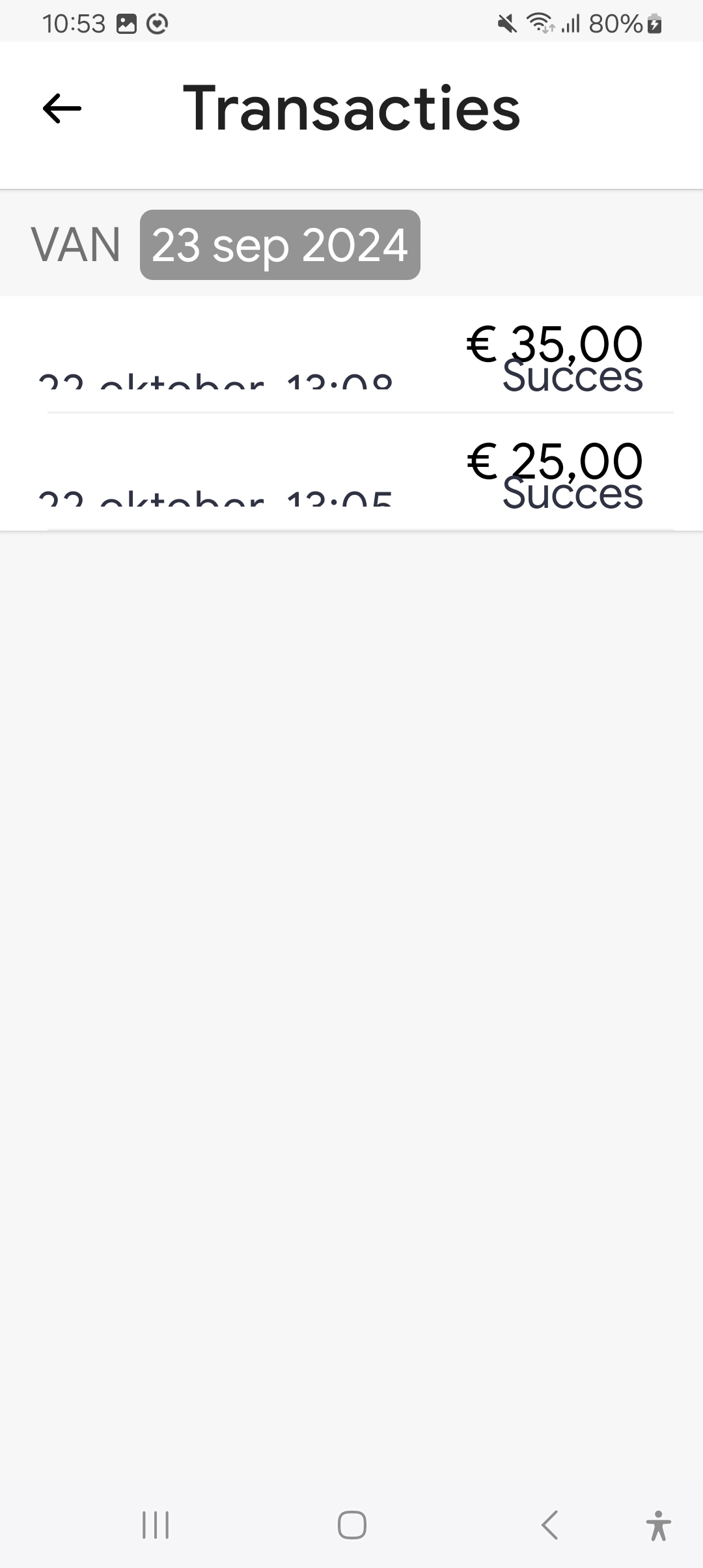
Transacties
Uitkomst: Onvoldoende
Instellingen
Uitkomst: Onvoldoende
Hele sample
Bevindingen:
Visually impaired users often set a larger font on their phone, so that the texts are easier to read. Make sure that all text in the app can be displayed enlarged. In addition, enlarged text may not be shortened, overlap other text or no longer be visible. This does not work well in the following parts.
Tegoeden overzicht
In the blocks with credits, texts are running through each other. See screenshot 5. This issue occurs in these blocks on multiple screens, such as in Verzoek betaling. Make sure that these blocks can grow in height with larger text.
Transacties
Text within the items is partly missing at the bottom. See screenshot 4. This also applies to the details in the popup when you select a transaction.
Instellingen
Texts within items run into each other, such as in Privacybeleid.
1.4.5: Afbeeldingen van tekst
Hele sample
Uitkomst: Voldoende
1.4.10: Reflow
Hele sample
Uitkomst: Voldoende
1.4.11: Contrast van niet-tekstuele content
Hele sample
Uitkomst: Onvoldoende
Welkomstscherm
Uitkomst: Onvoldoende
Inlogscherm stap 4 Informatie delen
Uitkomst: Onvoldoende
Pincode invoeren (2x)
Uitkomst: Onvoldoende
Hele sample
Bevindingen:
Graphic elements must have a contrast of at least 3:1. This also applies to the borders or background color of input fields. The elements below are below these values in terms of contrast.
Welkomstscherm
The light blue dots indicating the number of steps (2.2:1).
Inlogscherm stap 4 Informatie delen
The switch to turn on reporting (gray/gray, 1.1:1). These are also under Account/Instellingen.
Pincode invoeren (2x)
The dots indicating the input (1.4:1).
1.4.12: Tekstafstand
Hele sample
Uitkomst: Voldoende
1.4.13: Content bij hover of focus
Hele sample
Uitkomst: Niet van toepassing
2 Bedienbaar
2.1 Toetsenbordtoegankelijk
Success Criterium
Uitkomst
Bevindingen
2.1.1: Toetsenbord
Hele sample
Uitkomst: Onvoldoende
Tegoeden overzicht
Uitkomst: Onvoldoende
Geldig tegoed QR tonen
Uitkomst: Onvoldoende
Instellingen
Uitkomst: Onvoldoende
Tegoeden overzicht
The button to view transactions does not work with the keyboard.
Geldig tegoed QR tonen
The back button and the information link (i-icon) do not work with the keyboard.
Instellingen
The settings switches do not work with the keyboard. These can best be made active via the enter key.
2.1.2: Geen toetsenbordval
Hele sample
Uitkomst: Onvoldoende
Verzoek betaling
Uitkomst: Onvoldoende
Verzoek betaling
When you have sent the payment, you will come to a confirmation screen. You cannot close this screen with the keyboard. The 'OK' button cannot be operated. The escape key does not work either.
2.1.4: Enkel teken sneltoetsen
Hele sample
Uitkomst: Niet van toepassing
2.2 Genoeg tijd
Success Criterium
Uitkomst
Bevindingen
2.2.1: Timing aanpasbaar
Hele sample
Uitkomst: Niet van toepassing
2.2.2: Pauzeren, stoppen, verbergen
Hele sample
Uitkomst: Niet van toepassing
2.3 Toevallen en fysieke reacties
Success Criterium
Uitkomst
Bevindingen
2.3.1: Drie flitsen of beneden drempelwaarde
Hele sample
Uitkomst: Voldoende
2.4 Navigeerbaar
Success Criterium
Uitkomst
Bevindingen
2.4.1: Blokken omzeilen
Hele sample
Uitkomst: Niet van toepassing
2.4.2: Paginatitel
Hele sample
Uitkomst: Niet van toepassing
2.4.3: Focus volgorde
Hele sample
Uitkomst: Onvoldoende
Geldig tegoed QR tonen
Uitkomst: Onvoldoende
Geldig tegoed QR tonen
The focus remains on the underlying screen with the list. This makes it unclear to screen reader users that the credit is shown with the QR code. Make sure that the focus in this screen can only come to the selected credit so that it is read out.
2.4.4: Linkdoel (in context)
Hele sample
Uitkomst: Voldoende
2.4.5: Meerdere manieren
Hele sample
Uitkomst: Niet van toepassing
2.4.6: Koppen en labels
Hele sample
Uitkomst: Voldoende
2.4.7: Focus zichtbaar
Hele sample
Uitkomst: Voldoende
Hele sample
Bevindingen:
Note: There is a difference in color, but it has a very low contrast, so users can still miss it. See also 1.4.11.
2.5 Input Modaliteiten
Success Criterium
Uitkomst
Bevindingen
2.5.1: Aanwijzergebaren
Hele sample
Uitkomst: Niet van toepassing
2.5.2: Aanwijzerannulering
Hele sample
Uitkomst: Voldoende
2.5.3: Label in naam
Hele sample
Uitkomst: Voldoende
2.5.4: Bewegingsactivering
Hele sample
Uitkomst: Niet van toepassing
3 Begrijpelijk
3.1 Leesbaar
Success Criterium
Uitkomst
Bevindingen
3.1.1: Taal van de pagina
Hele sample
Uitkomst: Voldoende
3.1.2: Taal van onderdelen
Hele sample
Uitkomst: Niet van toepassing
3.2 Voorspelbaar
Success Criterium
Uitkomst
Bevindingen
3.2.1: Bij focus
Hele sample
Uitkomst: Voldoende
3.2.2: Bij input
Hele sample
Uitkomst: Voldoende
3.2.3: Consistente navigatie
Hele sample
Uitkomst: Niet van toepassing
3.2.4: Consistente identificatie
Hele sample
Uitkomst: Niet van toepassing
3.3 Assistentie bij invoer
Success Criterium
Uitkomst
Bevindingen
3.3.1: Foutidentificatie
Hele sample
Uitkomst: Niet van toepassing
Hele sample
Bevindingen:
Note: If the email address is entered incorrectly, you will still get the message 'check your inbox', but there is nothing in it. It would be better if there is a clear error message from the email address input.
At the top left is a button with an arrow to go back. This has no label for assistive software. There is a description of the image, but you have to activate the setting to announce this in TalkBack first. Give the button a clear label. This applies to more buttons, for example the 'close' button with the cross icon at the login code and the transactions button at Tegoeden.
Tegoeden overzicht
At the bottom of the screen is a menu. The role and status of these elements should be clearly indicated, for example 'Tegoeden tab, selected'. This is not clear to screen readers at the moment.
Geldig tegoed QR tonen
The content of this screen is not available to assistive software. Visually, it shows the selected credit, but for assistive software, you are still on the underlying list. Make sure that popups are also accessible to screen readers and that it is clear that a new window has opened.
4.1.3: Statusberichten
Hele sample
Uitkomst: Niet van toepassing
Sample
Welkomstscherm - Startscherm, ook bereikbaar via Account > Instellingen> App uitleg