Openbare voorzieningen moeten bruikbaar en toegankelijk zijn voor alle burgers. Net zoals een gebouw rolstoeltoegankelijk moet zijn, moet een website of mobiele app ook bediend kunnen worden door mensen met een beperking. Dit kunnen bijvoorbeeld visuele, auditieve of motorische beperkingen zijn. Denk aan slechtzienden, doven en slechthorenden en mensen die hun handen niet of in beperkte mate kunnen gebruiken. Ook cognitieve factoren spelen een rol: is de content voor iedereen te begrijpen?
Nederlandse overheidsorganisaties moeten voldoen aan de Web Content Accessibility Guidelines (WCAG) versie 2.1, onder de Europese standaard voor overheidswebsites EN 301 549. Deze criteria variëren van technisch functionele eisen zoals een goede werking met het toetsenbord tot aan meer inhoudelijke eisen zoals duidelijke foutmeldingen en een heldere navigatiestructuur.
Dit onderzoek is handmatig uitgevoerd volgens de WCAG-EM evaluatiemethode met ondersteuning van automatische test tools. De pagina’s uit de sample zijn onderzocht op alle 50 criteria onder WCAG 2.1 A en AA. Wanneer aan een criterium niet wordt voldaan, wordt hiervan minimaal één voorbeeld gegeven. Deze bevindingen kunnen op meer plekken voorkomen en moeten daarom structureel worden aangepakt.
De WCAG criteria zijn ingedeeld volgens vier principes, welke ook de leidraad vormen voor dit rapport: Waarneembaar, Bedienbaar, Begrijpelijk en Robuust. Gedetailleerde informatie over deze criteria is te vinden op de website van het W3C (Nederlandse vertaling).
Over deze evaluatie
Rapport auteur
Janita Top
Evaluatie opdrachtgever
Gemeente Eemsdelta
Evaluatiedatum
3 september 2024
Managementsamenvatting
Uit dit onderzoek blijkt dat wordt voldaan aan 35 van de 50 criteria voor toegankelijkheid. Veel onderdelen van de site zijn dus al goed toegankelijk, maar er zijn nog verbeteringen mogelijk.
Positief is bijvoorbeeld dat er geen afbeeldingen van tekst worden gebruikt, dat er een consistente navigatie aanwezig is en dat de pagina's op de goede taal staan ingesteld.
Verbeteringen zijn echter nog mogelijk op diverse punten, zoals:
Onjuiste of missende alt-teksten bij afbeeldingen
Invoervelden zonder labels
Niet alle functionaliteit werkt met het toetsenbord
De focus is niet op alle interactieve onderdelen zichtbaar
Scope van de evaluatie
Website naam
kansshop.eemsdelta.nl
Scope van de website
Alle pagina's op https://kansshop.eemsdelta.nl/.
Ingelogde pagina's op https://test-kansshop.eemsdelta.nl/.
Niet de pagina's in het proces van aanmelden als aanbieder onder https://kansshop.eemsdelta.nl/aanbieders/aanmelden.
WCAG Versie
2.1
Conformiteitsdoel
AA
Basisniveau van toegankelijkheid-ondersteuning
Gangbare webbrowsers en hulpapparatuur.
Verdere onderzoeksvereisten
Uitgebreide toetsresultaten
Samenvatting
Gerapporteerd over 50 van 50 WCAG 2.1 AA
Success Criteria.
24Voldoende
15Onvoldoende
11Niet van toepassing
0Niet getoetst
Alle resultaten
1 Waarneembaar
1.1 Tekstalternatieven
Success Criterium
Uitkomst
Bevindingen
1.1.1: Niet-tekstuele content
Hele sample
Uitkomst: Onvoldoende
Homepage
Uitkomst: Onvoldoende
Aanbieder Cigo Appingedam
Uitkomst: Onvoldoende
Aanvragen (proces)
Uitkomst: Onvoldoende
Tegoed digitale leermiddelen
Uitkomst: Onvoldoende
Declaraties (kosten terugvragen)
Uitkomst: Onvoldoende
Aanvragen
Uitkomst: Onvoldoende
Hele sample
Bevindingen:
When you enter a word in the search bar, a dropdown menu appears. For ‘Aanbod’, ‘Tegoeden’ en ‘Aanbieders’, icons are present without alternative text. Solution: Since these images seem decorative, it is recommended to hide them from assistive software using aria-hidden="true" on the svg element.
Homepage
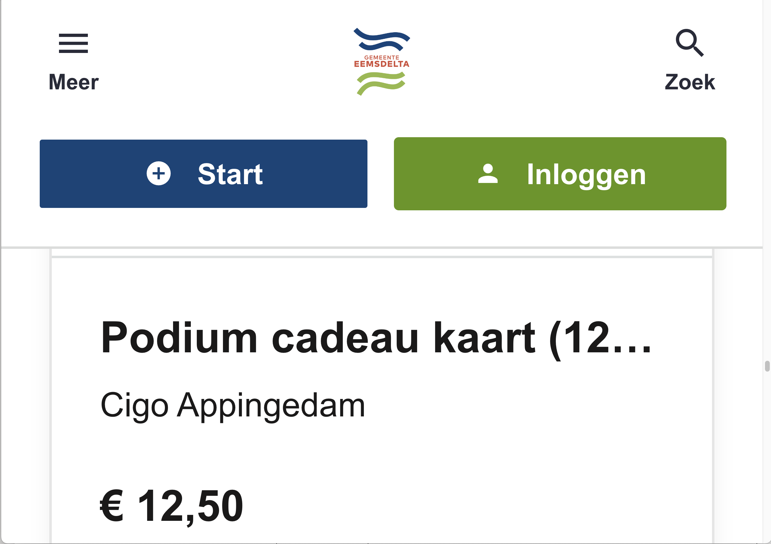
Below ‘Aanbod’ there are images for every offer. The alternative texts are repeating the heading below and are not always correct, for example ‘logo aanbod Gebak voor elk bijzonder moment.De aanbieder omschrijft het aanbod als volgt: Hema’. Also there is an image of Apple cables with the alt text ‘logo aanbod Apple Lightning laadset compleet.De aanbieder omschrijft het aanbod als volgt: Incentive VT-395’. There is no logo in this image. Solution: ensure the alternative texts are describing the image correctly and are short, for example: ‘logo Hema’ and ‘Apple lightning laadset’. This issue occurs on all pages with ‘Aanbod’ items (in listings and in detail view).
Aanbieder Cigo Appingedam
On the map is am image of a logo with the alternative text ‘office photo’. This is not correct. Solution: change the text to ‘logo Cigo Appingedam’. Below the title ‘Vestigingen’ is an image without alternative text. Solution: remove the role=”img” and aria-label. This image is decorative and doesn’t need to be presented to assistive technology.
Aanvragen (proces)
There is an info icon before the first step. This is hidden for screenreaders via aria-hidden, while it is available for sighted users. Solution: remove the aria-hidden attribute and add a ‘screenreader text’ within the div-element of the icon with ‘information’.
Tegoed digitale leermiddelen
Within the content of the offer is an image of a QR code. There is no alternative text for this image. Solution: canvas elements do not have alt text. Provide a description in the HTML near the image.
Declaraties (kosten terugvragen)
Next to the reimbursements are images. First there is a div-element with the role of img and no alternative text. Within this element is an img-element with the alternative text “reimbursement image”. There are two problems here: images without alternative text and images with an alternative text that doesn’t add any value. Solution: remove the img-role from the div and give the img an empty alt-attribute so screenreaders will ignore them.
Aanvragen
The logo of ‘Stadjerspas’ has the alt-text ‘fund image’. This is not correct. Solution: always ensure the alt-text is describing the image correctly, like ‘Logo Stadjerspas’. NB: I know this is test data, but since I can’t test with the real data I am filing the issue here as an example.
1.2 Op tijd gebaseerde media
Success Criterium
Uitkomst
Bevindingen
1.2.1: Louter-geluid en louter-videobeeld (vooraf opgenomen)
Hele sample
Uitkomst: Niet van toepassing
1.2.2: Ondertitels voor doven en slechthorenden (vooraf opgenomen)
Hele sample
Uitkomst: Niet van toepassing
1.2.3: Audiodescriptie of media-alternatief (vooraf opgenomen)
Hele sample
Uitkomst: Niet van toepassing
1.2.4: Ondertitels voor doven en slechthorenden (live)
Hele sample
Uitkomst: Niet van toepassing
1.2.5: Audiodescriptie (vooraf opgenomen)
Hele sample
Uitkomst: Niet van toepassing
1.3 Aanpasbaar
Success Criterium
Uitkomst
Bevindingen
1.3.1: Info en relaties
Hele sample
Uitkomst: Onvoldoende
Regelingen overzicht
Uitkomst: Onvoldoende
Aanbod overzicht
Uitkomst: Onvoldoende
Aanbieders
Uitkomst: Onvoldoende
Zoekresultaten
Uitkomst: Voldoende
Aanvragen (proces)
Uitkomst: Onvoldoende
Declaraties (kosten terugvragen)
Uitkomst: Onvoldoende
Aanvragen
Uitkomst: Onvoldoende
Random pagina 1 - Aanbod tegoedbon reparatie smartphone/tablet
Uitkomst: Onvoldoende
Status aanvraag
Uitkomst: Onvoldoende
Hele sample
Bevindingen:
When you enter a word in the search field, a popup opens with suggestions. There are headings for the sections in the right panel (Aanbod, Tegoeden en Aanbieders), which are not marked up as headings. They are just div-elements with a ‘title’ class. Solution: Code the headings as h2-elements. NB: the buttons on the left are coded as button and as h2, but these are no headings, just buttons. Screenreaders ignore the h2-element here. See also 4.1.2.
In the footer are subheadings marked up with the strong-element: ‘Postadres’ en ‘Bezoekadres’. Assistive software doesn’t recognize these texts as headings. Solution: mark up the headings as h4-elements.
Regelingen overzicht
In the pagination it is visible by means of styling which page you are on. This cannot be understood from the code for assistive software. Also it’s not clear from the markup that these elements are in a group. Solution: since buttons are used here instead of links, the attribute ‘aria-selected’ could be used for the active page. As group element a nav-element can be used, with an aria-label attribute ‘paginatie’. This issue occurs on several pages where pagination is used, like ‘Aanbod’.
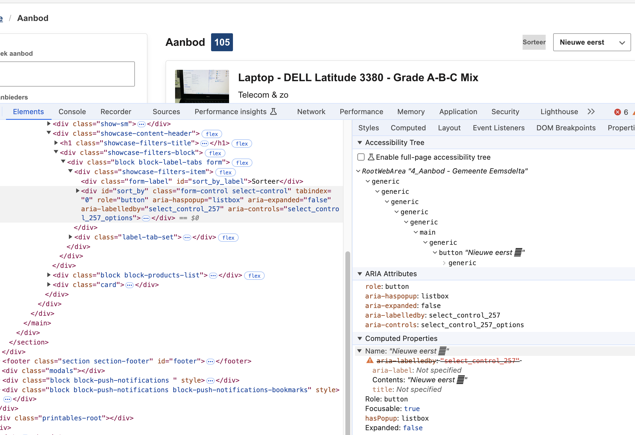
Aanbod overzicht
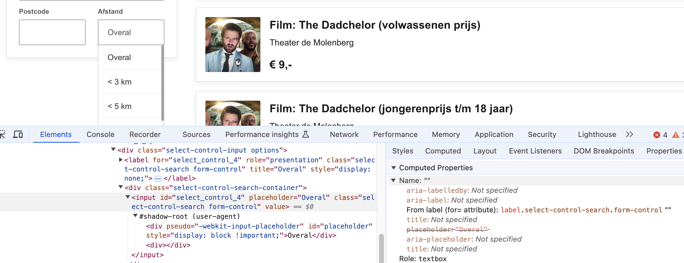
The input for ‘afstand’ has no label. Users of assistive software don’t know where this input is for. See screenshot 4. Solution: Associate the label for ‘afstand’ with the input by means of ‘for’ and the correct id. See also 4.1.2.
Above the list, on the top right, there is an input field for sorting. However, the label 'sorteer' is not linked to the input (listbox), causing it not to be read by screen readers. See screenshot 5. Solution: link the button to the ‘sorteer’ label by means of an id. Note: the ‘aria-labelledby’ attribute can take multiple id’s. This issue also occurs on the ‘Aanbieders’ page.
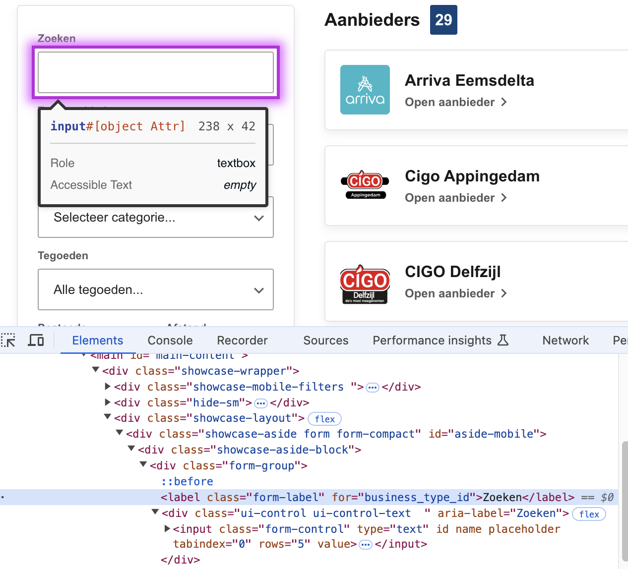
Aanbieders
The search input field is missing a label. There is a label element, but it’s not associated with the right id. See screenshot 1. Solution: correct the id so that the input and label are connected.
Zoekresultaten
Remark: the page doesn’t have a h1-heading and therefore no main title describing the page. Solution: ensure no headings levels are skipped to provide a clear structure.
Aanvragen (proces)
Above the content is a list with steps. In the layout is visible which step you are in. For screenreaders this information is not available. Solution: remove the aria-hidden attribute on the enclosing div-element. Code the steps as a list (ul and li-elements). Add an aria-current=”step” attribute to the current step.
Within steps subheadings like ‘Bewijsstukken’ are marked up with the strong-element instead of headings. Assistive software doesn’t recognize these texts as headings. Solution: mark up the headings as h3-elements.
Within step 6 is an input field for a telephone number. This input has no label for assistive software. Solution: Put the text of the visible label in a label element and associate it with the input by means of for=”id”.
Declaraties (kosten terugvragen)
Within the details of a ‘declaratie’ there is visually a table with data. For assistive software this structure is not clear. Solution: put the name/value pairs below ‘Declaratie gegevens’ in a table or definition list. This isse also occurs within the details of a ‘aanvraag’.
Aanvragen
The list with ‘aanvragen’ has visually styled headings. In the code they are not marked up as headings, just as div-elements with a title class. Solution: code the headings as h2-elements.
Random pagina 1 - Aanbod tegoedbon reparatie smartphone/tablet
Below ‘Tegoeden’ is visually a list of items. In the code there are only div-elements. For assistive software it’s not clear that this is a list. Solution: code the items within a ul-element.
Status aanvraag
The heading above the content is not marked up as heading element. Solution: code the heading as h1-element.
The input field to reply to the message doesn’t have a label. Solution: add a label element and link the label by means of an id to the textarea.
1.3.2: Betekenisvolle volgorde
Hele sample
Uitkomst: Voldoende
1.3.3: Zintuiglijke eigenschappen
Hele sample
Uitkomst: Voldoende
1.3.4: Weergavestand
Hele sample
Uitkomst: Voldoende
1.3.5: Identificeer het doel van de input
Hele sample
Uitkomst: Onvoldoende
Aanvragen (proces)
Uitkomst: Onvoldoende
Aanvragen (proces)
The input field for the email address (during login) does not have a mechanism to autocomplete the input. This makes filling out forms easier for many users, for example for people for whom entering text takes a lot of time because it is done via special tools, or for people with cognitive disabilities. In this case the email address is even more important, because it has to be filled in repeatedly to log in. Solution: This can be improved by placing an 'autocomplete' attribute at the input field. For more information see https://www.w3.org/WAI/WCAG21/Techniques/html/H98 and for a list of all attributes https://www.w3.org/TR/WCAG21/#input-purposes . This issue also occurs in step 6 at the input for telephone number.
1.4 Onderscheidbaar
Success Criterium
Uitkomst
Bevindingen
1.4.1: Gebruik van kleur
Hele sample
Uitkomst: Voldoende
1.4.2: Geluidsbediening
Hele sample
Uitkomst: Niet van toepassing
1.4.3: Contrast (minimum)
Hele sample
Uitkomst: Onvoldoende
Hele sample
Bevindingen:
Text must have a contrast of at least 4.5:1 for visually impaired and color blind people. This also applies to active elements such as hover and focus. The elements on the website mentioned below are below these values in terms of contrast. Solution: increase the contrast to at least 4.5:1.
White/green combinations, for example:
Header: the button for ‘inloggen’ (3.6:1).
When logged in: the button ‘Mijn tegoeden’.
Search window: ‘Bekijk alle resultaten’ and the category when zoomed in.
1.4.4: Herschalen van tekst
Hele sample
Uitkomst: Onvoldoende
Homepage
Uitkomst: Onvoldoende
Hele sample
Bevindingen:
Make the layout responsive in such a way that all content remains available to at least 200% when zooming in. This is not the case in the following places on the site.
The search input text gets obscured above 100%. See screenshot 8.
Homepage
The text of the ‘Aanbod’ items gets partly obscured above 100%. See screenshot 6 and screenshot 7. Solution: If text needs more space, don’t make the items fixed in height.
1.4.5: Afbeeldingen van tekst
Hele sample
Uitkomst: Voldoende
1.4.10: Reflow
Hele sample
Uitkomst: Onvoldoende
Aanvragen
Uitkomst: Voldoende
Emailinstellingen
Uitkomst: Onvoldoende
Hele sample
Bevindingen:
Make the layout responsive in such a way that content can be presented without loss of information or functionality, and without requiring scrolling in two dimensions when zooming in to a minimum of 400% (comparable to 320px wide). This is not the case in the following places on the site. (Tested at 1280px wide.)
Aanvragen
Remark: at 100% there are in text 7 steps. When you zoom in, this changes to ‘step 1 of 9’. This is confusing. Solution: always show the same number of steps.
Emailinstellingen
At 400% you need to scroll horizontally to read all content. The text ‘Hoofd e-mailadres’ gets partly cut off.
1.4.11: Contrast van niet-tekstuele content
Hele sample
Uitkomst: Onvoldoende
Uitleg
Uitkomst: Onvoldoende
Zoekresultaten
Uitkomst: Onvoldoende
Hele sample
Bevindingen:
Graphic elements must have a contrast of at least 3:1. This also applies to the borders or background color of input fields. The elements on the website mentioned below are below these values in terms of contrast. Solution: increase the contrast to at least 3:1.
Uitleg
The arrow icons to open/close the faq sections (2.5:1)
Zoekresultaten
The borders of the checkboxes below ‘uitgelicht’ (1.5:1)
1.4.12: Tekstafstand
Hele sample
Uitkomst: Voldoende
1.4.13: Content bij hover of focus
Hele sample
Uitkomst: Niet van toepassing
2 Bedienbaar
2.1 Toetsenbordtoegankelijk
Success Criterium
Uitkomst
Bevindingen
2.1.1: Toetsenbord
Hele sample
Uitkomst: Onvoldoende
Regelingen overzicht
Uitkomst: Onvoldoende
Uitleg
Uitkomst: Onvoldoende
Zoekresultaten
Uitkomst: Onvoldoende
Aanvragen (proces)
Uitkomst: Onvoldoende
Random pagina 2 - Notificatievoorkeuren
Uitkomst: Onvoldoende
Status aanvraag
Uitkomst: Onvoldoende
Emailinstellingen
Uitkomst: Onvoldoende
Hele sample
Bevindingen:
When you enter a word in the search field, a popup opens with suggestions. The buttons on the left can’t be activated by keyboard if you don’t use a screenreader (a screenreader gives extra suggestions for keys in a menu role). Solution: make the buttons work with either the enter of spacebar key, as is expected in web navigation. See also 4.1.2.
Regelingen overzicht
When you are zoomed in to 150% or more, the filter options will appear behind a button. This button can’t be activated with a keyboard. Solution: code the button as a button element. See also 4.1.2.
Uitleg
The faq-sections can’t be opened with a keyboard. Solution: use button elements instead of span elements to ensure keyboard functionality.
Zoekresultaten
In the filters sections are checkboxes of categories. These checkboxes can’t be used by keyboard. Solution: ensure all inputs can be operated by keyboard. Adapt the div-element with the role of checkbox or use the input element as intended by removing the aria-hidden attribute.
Aanvragen (proces)
At the top of the page is a message with a ‘cross’-button. This message cannot be closed with the keyboard. See also 4.1.2. Especially when zoomed in this message takes a lot of screen space. When you can’t close it, it’s hard to read the content of the page. See screenshot 9.
Random pagina 2 - Notificatievoorkeuren
The toggle buttons cannot be used by keyboard. Solution: see 4.1.2 for a correct markup.
Status aanvraag
There is a button to open details with the text ‘Bekijk’. This button can’t be used with a keyboard. Solution: code the button as a button element. See also 4.1.2.
Emailinstellingen
There is a button to add another emailadres. This button can’t be activated with a keyboard. Solution: code the button as a button element (preferably) or add keyboard functionality to the div-element.
2.1.2: Geen toetsenbordval
Hele sample
Uitkomst: Voldoende
2.1.4: Enkel teken sneltoetsen
Hele sample
Uitkomst: Niet van toepassing
2.2 Genoeg tijd
Success Criterium
Uitkomst
Bevindingen
2.2.1: Timing aanpasbaar
Hele sample
Uitkomst: Onvoldoende
Homepage
Uitkomst: Onvoldoende
Hele sample
Bevindingen:
The user is logged out without a warning and without the possibility to extend the time limit. Solution: according to SC 2.2.1 there are multiple possible solutions. The most suitable solution in this case seems the following one: Extend: The user is warned before time expires and given at least 20 seconds to extend the time limit with a simple action (for example, "press the space bar"), and the user is allowed to extend the time limit at least ten times. See also https://www.w3.org/WAI/WCAG22/Understanding/timing-adjustable.html.
Homepage
When you are logged in, the offers have buttons with a heart. When you activate this, a message will appear briefly with a link on the bottom of the page. This message disappears after a few seconds, and cannot be extended or shown again. Solution: Ensure that the message remains on screen until the user clicks it away. Also make sure it can be used with keyboard. (This could not be tested, beause it was gone before reaching it by keyboard.)
2.2.2: Pauzeren, stoppen, verbergen
Hele sample
Uitkomst: Niet van toepassing
2.3 Toevallen en fysieke reacties
Success Criterium
Uitkomst
Bevindingen
2.3.1: Drie flitsen of beneden drempelwaarde
Hele sample
Uitkomst: Onvoldoende
Hele sample
Bevindingen:
When you go back to a page where login is necessary but in meantime you are logged out, the page flashes very quickly multiple times before serving the message you have to log in again (noticed in Chrome). This can induce seizures to users due to photosensitivity. Solution: remove the multiple pageloads. See also 2.2.1 for logging out automatically.
2.4 Navigeerbaar
Success Criterium
Uitkomst
Bevindingen
2.4.1: Blokken omzeilen
Hele sample
Uitkomst: Voldoende
Hele sample
Bevindingen:
Remark: there is a skiplink present, but the link doesn’t work because the target is empty (#). Solution: add #main-content as target to the skiplink. Ensure the target id is present on every page. Also make sure the skiplink keeps visible after zooming in. Now it’s hidden above 150%.
2.4.2: Paginatitel
Hele sample
Uitkomst: Onvoldoende
Aanbod theatervoorstelling De grote vloed
Uitkomst: Onvoldoende
Zoekresultaten
Uitkomst: Onvoldoende
Aanbod theatervoorstelling De grote vloed
The page does not have a descriptive page title, it’s called ‘meedoen’. This issue occurs on multiple pages. Solution: make sure every page has a descriptive, unique title within the title-element.
Zoekresultaten
The page doesn’t have a title. For users of assistive software, it is important for navigation between documents/web pages that the title makes it clear where they are. Solution: make sure every page has a descriptive, unique title within the title-element.
2.4.3: Focus volgorde
Hele sample
Uitkomst: Onvoldoende
Regelingen overzicht
Uitkomst: Onvoldoende
Declaraties (kosten terugvragen)
Uitkomst: Onvoldoende
Regelingen overzicht
After activating a link in the pagination, focus is staying within the pagination or placed in the footer. Expected is to be on top of the results of this new page, so this is confusing for users. Now you have to navigate back up to the page. Solution: put the focus on the first result after activating a new page.
Declaraties (kosten terugvragen)
When you have uploaded a document and want to proceed to the next field in the form, focus is placed on top of the page. This means you have to navigate again (without working skiplink if you use a screenreader) through the whole page to the relevant place in the form. Solution: set the focus to the last used or the next input field in the form after selecting an option or adding a upload.
2.4.4: Linkdoel (in context)
Hele sample
Uitkomst: Voldoende
2.4.5: Meerdere manieren
Hele sample
Uitkomst: Voldoende
2.4.6: Koppen en labels
Hele sample
Uitkomst: Onvoldoende
Regelingen overzicht
Uitkomst: Onvoldoende
Regelingen overzicht
The title for this section in the main navigation is ‘Regelingen’, but the title on the page itself is ‘Aanvragen’. This can be confusing for users. (And in the search popup it’s called ‘Tegoeden’.) Solution: be consistent in the naming of sections, keep it ‘Aanvragen’ everywhere or ‘Regelingen’ everywhere.
2.4.7: Focus zichtbaar
Hele sample
Uitkomst: Onvoldoende
Regelingen overzicht
Uitkomst: Onvoldoende
Hele sample
Bevindingen:
When you navigate through the main menu when zoomed in, the focus continues to invisible items after the menu. Solution: make sure only items within the popup menu can get focus. Only after closing the menu the focus should go back to the page underneath.
When there is a message on top of the page, it covers the button to close the main menu. It gets focus, but it is not visible. Solution: Put the close button below the message and make it possible to close the message with keyboard.
Regelingen overzicht
In the filter sections the focus on the select lists (‘Alle organisaties’ en ‘Alle categorieën’) is not visible. Therefore it looks like it doesn’t work with a keyboard. Solution: provide a visible focus style when the inputs are focused. See also 4.1.2. This issue occurs on all select lists, like ‘afstand’ and ‘sorteer’.
2.5 Input Modaliteiten
Success Criterium
Uitkomst
Bevindingen
2.5.1: Aanwijzergebaren
Hele sample
Uitkomst: Niet van toepassing
2.5.2: Aanwijzerannulering
Hele sample
Uitkomst: Voldoende
2.5.3: Label in naam
Hele sample
Uitkomst: Voldoende
2.5.4: Bewegingsactivering
Hele sample
Uitkomst: Voldoende
3 Begrijpelijk
3.1 Leesbaar
Success Criterium
Uitkomst
Bevindingen
3.1.1: Taal van de pagina
Hele sample
Uitkomst: Voldoende
3.1.2: Taal van onderdelen
Hele sample
Uitkomst: Niet van toepassing
3.2 Voorspelbaar
Success Criterium
Uitkomst
Bevindingen
3.2.1: Bij focus
Hele sample
Uitkomst: Voldoende
3.2.2: Bij input
Hele sample
Uitkomst: Voldoende
3.2.3: Consistente navigatie
Hele sample
Uitkomst: Voldoende
3.2.4: Consistente identificatie
Hele sample
Uitkomst: Voldoende
3.3 Assistentie bij invoer
Success Criterium
Uitkomst
Bevindingen
3.3.1: Foutidentificatie
Hele sample
Uitkomst: Voldoende
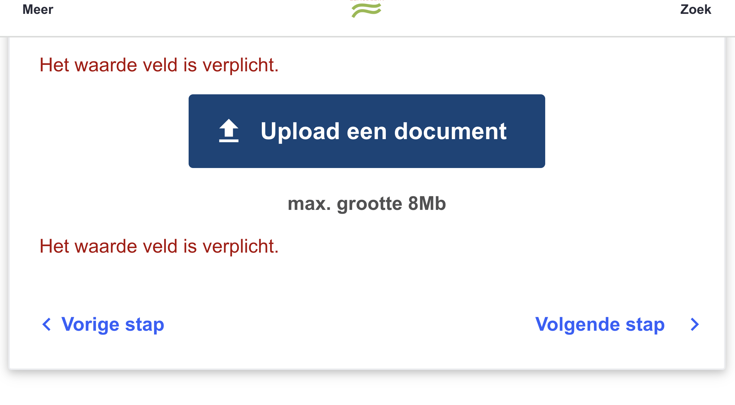
Aanvragen (proces)
Uitkomst: Onvoldoende
Aanvragen (proces)
When submitting to the next step is not executed, there is no clear error identification. There are multiple error messages with the description ‘Het waarde veld is verplicht.’ This is very general, and the ‘’verplicht’ part is only an instruction, not an error. See screenshot 10. Solution: describe to the user in text which field is in error and how it can be corrected. For example: ‘Er is nog niet akkoord gegaan met de voorwaarden, maar dit veld is verplicht.’ and ‘ Er is geen document met bewijs toegevoegd, en deze bijlage is verplicht’. This issue occurs in multiple steps.
When you enter a word in the search field, a popup opens with suggestions. This list is not coded correctly. On the input field is the attribute ‘aria-haspopup’ with the value of ’true’, which indicates a menu. The ‘menu’-role is permitted, but primarily meant for desktop applications. To use them in a website can be confusing for users. The content of the popup has a container role of menu, but has no children elements of menu-items. Solution: If you use a menu, code it according to the specification (https://www.w3.org/TR/wai-aria-1.1/#menu) including the right focus management. It’s recommended though to use a combobox, which is more appropriate for search suggestions on a website. See https://www.w3.org/TR/wai-aria-1.1/#combobox.
When you activate the ‘Gebruikersmenu’ button (when logged in), a popup opens with links. This list is not coded correctly. The button has the attribute ‘aria-haspopup’ with the value of ’true’, which indicates a menu. But there is no menu element following. This is very confusing for users of assistive software. The screenreader announces a menu, but doesn’t announce the links in the list. Solution: If you use a menu, code it according to the specification (https://www.w3.org/TR/wai-aria-1.1/#menu) including the right focus management. It’s recommended though to use a ‘normal’ ul-element with list-items and links, since this is a more common and expected pattern in web navigation. Also ensure interactive elements are not nested, since this often gives problems for keyboard en screenreader users. So don’t put links inside a button, as this is the case here.
When you choose in the user menu 'Log in to the app', a popup will open. This contains input fields for 6 numbers. All inputs have the same label text (and a type of telephone, while it’s no telephone number). The inputs are not grouped. This makes it unclear what needs to be filled in where. Solution: add a descriptive label to all input fields (for example ‘nummer 1’). Group them in a fieldset with a legend. The instruction ‘Vul de zes cijfers die in uw app verschijnen hieronder in’ can be put in the legend element.
Regelingen overzicht
In the filter sections are input fields which visually resemble a select with options, but they are buttons that open a list box. The role and operation of this is not clear to users of assistance software. The listbox does not have an accessible name. Input fields are also nested. With the keyboard it does not work as expected with a listbox with the enter key to open the list and the arrow keys to navigate between the options. Solution: use the native select element to provide the options. This will be accessible to users of keyboard and assistive software by default. This issue occurs on multiple pages where filters are used, like ‘Aanbod’.
When you are zoomed in to 150% or more, the filter options will appear behind a button. This is a div element without a clear role. Solution: code the button as a button element.
Uitleg
The ‘buttons’ to open the faq-sections do not provide information about the state. Solution: add an aria-expanded attribute. See also 2.1.1
Aanvragen (proces)
Below step 2 is a checkbox. This checkbox doesn’t have a correct role and state. The screenreader announces it is a ‘group’ and doesn’t say the checked/unchecked state. Solution: remove the ‘hidden’ attribute from the checkbox input. Remove the aria-checked attribute from the label. Associate the label with the input via an id. This issue occurs on several steps.
At the top of the page is a message with a ‘cross’-button. This element does not have a proper role and name. See screenshot 9. This message also hides the button the close the main menu. Solution: code this button as a button element with a clear text.
After opening a preview of a document in step 6, there is a close button without a text. Solution: add an aria-label attribute with ‘Sluit preview’.
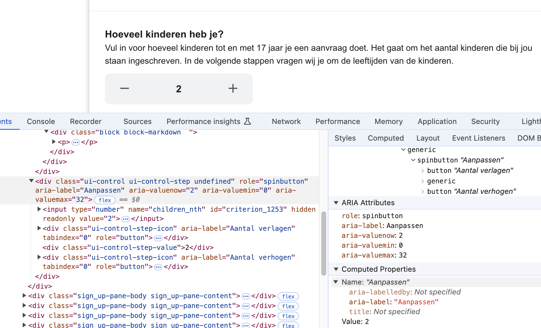
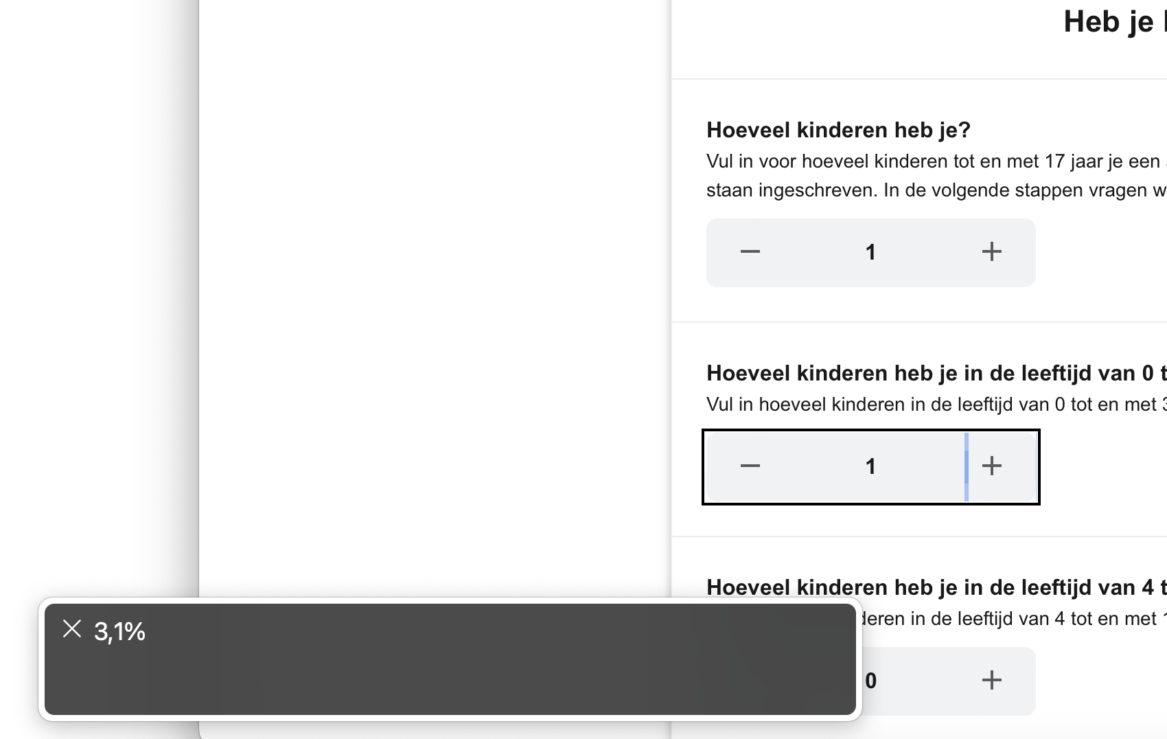
In several steps are ‘steppers’ (spin buttons), for example to add the number of children. The name and value of each step is not clear from the markup. Within a stepper, you must be able to use the arrow keys to increase or decrease the value. Now this has to be done with separate buttons. When activated, a percentage is announced by the screenreader, which makes no sense. See screenshot 2 and screenshot 3. Solution: give each stepper a clear label, like ‘aantal kinderen 0-3 jaar’ (instead of ‘aanpassen’), and implement the steppers according to the specification, so the right amount is announced when updated.
Verlanglijst
Interactive elements are nested within the items in the list. There is a button (the heart icon) within a link. Ensure interactive controls are not nested as they are not always announced by screen readers or can cause focus problems for assistive technologies. Solution: mark up the list with ul and li-elements, and put within the li-element the link and button after each other on the same level.
Declaraties (kosten terugvragen)
When uploading a document, there are tooltip icons in the form. These are buttons without a text (name). Solution: put the aria-label attribute on the div-element with a role of button.
Random pagina 2 - Notificatievoorkeuren
Interactive elements are nested within the section with the toggle buttons. There are label elements with the role of checkbox with nested checkboxes inside. Ensure interactive controls are not nested as they are not always announced by screen readers or can cause focus problems for assistive technologies. Solution: remove the role of checkbox from the label element, as well as the aria-checked attribute. Remove the aria-hidden attribute from the input element, so it will be announced to assistive software.
Status aanvraag
There is a button to open details with the text ‘Bekijk’. This button doesn’t have a correct role. Also it doesn’t provide information that more content can be opened. Solution: code the button as a button element. Also add an aria-expanded attribute.