Onderzoek toegankelijkheid Forus webshop Goeree-Overflakkee
Inleiding
Openbare voorzieningen moeten bruikbaar en toegankelijk zijn voor alle burgers. Net zoals een gebouw rolstoeltoegankelijk moet zijn, moet een website of mobiele app ook bediend kunnen worden door mensen met een beperking. Dit kunnen bijvoorbeeld visuele, auditieve of motorische beperkingen zijn. Denk aan slechtzienden, doven en slechthorenden en mensen die hun handen niet of in beperkte mate kunnen gebruiken. Ook cognitieve factoren spelen een rol: is de content voor iedereen te begrijpen?
Nederlandse overheidsorganisaties moeten voldoen aan de Web Content Accessibility Guidelines (WCAG) versie 2.1, onder de Europese standaard voor overheidswebsites EN 301 549. Deze criteria variëren van technisch functionele eisen zoals een goede werking met het toetsenbord tot aan meer inhoudelijke eisen zoals duidelijke foutmeldingen en een heldere navigatiestructuur.
Dit onderzoek is handmatig uitgevoerd volgens de WCAG-EM evaluatiemethode met ondersteuning van automatische test tools. De pagina’s uit de sample zijn onderzocht op alle 50 criteria onder WCAG 2.1 A en AA. Wanneer aan een criterium niet wordt voldaan, wordt hiervan minimaal één voorbeeld gegeven. Deze bevindingen kunnen op meer plekken voorkomen en moeten daarom structureel worden aangepakt.
De WCAG criteria zijn ingedeeld volgens vier principes, welke ook de leidraad vormen voor dit rapport: Waarneembaar, Bedienbaar, Begrijpelijk en Robuust. Gedetailleerde informatie over deze criteria is te vinden op de website van het W3C (Nederlandse vertaling).
Over deze evaluatie
- Rapport auteur
- Janita Top
- Evaluatie opdrachtgever
- Forus
- Evaluatiedatum
- 18 december 2023
Managementsamenvatting
Uit dit onderzoek blijkt dat wordt voldaan aan 24 van de 50 criteria voor toegankelijkheid. Veel onderdelen van de site zijn dus al goed toegankelijk, maar er zijn nog verbeteringen mogelijk.
Positief is bijvoorbeeld dat er geen afbeeldingen van tekst worden gebruikt, dat er een consistente navigatie aanwezig is en dat de pagina's op de goede taal staan ingesteld.
Verbeteringen zijn echter nog mogelijk op diverse punten, zoals:
- Onjuiste of missende alt-teksten bij afbeeldingen
- Invoervelden zonder labels
- Niet alle content is bereikbaar bij inzoomen
- Niet alle functionaliteit werkt met het toetsenbord
Naast de verplichte WCAG 2.1 criteria zijn ook de in WCAG 2.2 toegevoegde criteria op niveau A en AA onderzocht. Hierbij waren er bevindingen bij 1 succescriterium.
Scope van de evaluatie
- Website naam
- Forus webshop Goeree-Overflakkee
- Scope van de website
- Alle pagina's op https://test-meedoen.goeree-overflakkee.nl/.
- WCAG Versie
- 2.1
- Conformiteitsdoel
- AA
- Basisniveau van toegankelijkheid-ondersteuning
- Gangbare webbrowsers en hulpapparatuur.
- Verdere onderzoeksvereisten
Op verzoek van de opdrachtgever zijn alle bevindingen in het Engels beschreven.
Uitgebreide toetsresultaten
Samenvatting
Gerapporteerd over 50 van 50 WCAG 2.1 AA Success Criteria.
- 13 Voldoende
- 26 Onvoldoende
- 11 Niet van toepassing
- 0 Niet getoetst
Gerapporteerd over 6 van 6 in WCAG 2.2 toegevoegde A en AA Success Criteria.
- 4 Voldoende
- 1 Onvoldoende
- 1 Niet van toepassing
- 0 Niet getoetst
Alle resultaten
1 Waarneembaar
1.1 Tekstalternatieven
| Success Criterium | Uitkomst | Bevindingen |
|---|---|---|
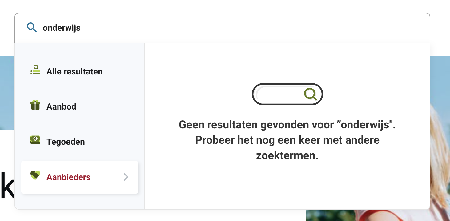
| 1.1.1: Niet-tekstuele content | Hele sampleUitkomst: Onvoldoende Hele sampleUitkomst: Onvoldoende homepageUitkomst: Onvoldoende regelingenUitkomst: Onvoldoende aanbod product Zwemtraject AUitkomst: Onvoldoende aanbieder Sport4AllGOUitkomst: Onvoldoende aanmelden als aanbieder (proces)Uitkomst: Onvoldoende declaraties (kosten terugvragen)Uitkomst: Onvoldoende | Hele sampleBevindingen: The logo has the alt-text ‘Goeree-Overflakkee’, but in the image is also the text ‘gemeente’ visible. Screenreader users get different information than sighted users. Solution: change the alt-text to ‘Gemeente Goeree-Overflakkee’. When you're zoomed in from 150%, the logo has the alt-text ‘Terug naar de hoofdpagina’. The information on the logo is omitted. Solution: change the alt-text to ‘Gemeente Goeree-Overflakkee’. On other pages then home the link information can be added to the link tekst. This can be added to the alt-tekst, but the logo information also has to be present. When you enter a word in the search bar, a dropdown menu appears. For ‘Aanbod’, ‘Tegoeden’ en ‘Aanbieders’, icons are present without alternative text. When there no result in a category, a svg-image is displayed looking like an input field without alternative text. See screenshot 1. Solution: Since these images seem decorative, it is recommended to hide them from assistive software using aria-hidden="true" on the svg element. homepageBelow ‘Aanbod’ are images of offers, which have very long, meaningless alternative texts like ‘Dit is een afbeelding van het aanbod Kinderkleding t.w.v. € 50 van aanbieder Hema Middelharnis. De aanbieder omschrijft het aanbod als volgt: Kinderkleding t.w.v. € 50’. This only gives a lot of noise to screenreader users. Because this image is part of a link, this alt-text also results in a very long link text. Solution: provide a good description of the image, like ‘Logo HEMA’, of leave the alt-text empty if the image is decorative. Note: it is never necessary to say in an alt-text that it’s an image, because screenreaders already mention this. This issue occurs on several pages where the offers are displayed. regelingenNext to each application is an image with a meaningless alternative text like ‘Dit is de afbeelding van Digitale leermiddelen’. This only gives a lot of noise to screenreader users. Solution: leave the alt-text of this images empty because they seem decorative. aanbod product Zwemtraject ANext to the location information is a decorative image with the alt-text ‘ Vestiging Stichting Sport en Recreatie Goeree-Overflakkee’. This doesn’t provide useful information for screenreader users. Solution: give the image an empty alt-attribute. aanbieder Sport4AllGOBelow the title ‘Vestigingen’ is an image without alternative text. aanmelden als aanbieder (proces)On the sign up page at https://staging.forus.io/provider/#!/sign-up the image has no alternative text. On the page of the company dashboard at the end of the sign up proces are a lot of icon images without alternative text. Solution: give these images an empty alt attribute. declaraties (kosten terugvragen)Above ‘Geen declaraties’ is a svg-image without alternative text. Solution: Since this image seems decorative, it is recommended to it from assistive software using aria-hidden="true" on the svg element. During the process to reclaim a new amount, next to the credit is an image without alternative text. Solution: give these images an empty alt-attribute. |
1.2 Op tijd gebaseerde media
| Success Criterium | Uitkomst | Bevindingen |
|---|---|---|
| 1.2.1: Louter-geluid en louter-videobeeld (vooraf opgenomen) | Hele sampleUitkomst: Niet van toepassing | |
| 1.2.2: Ondertitels voor doven en slechthorenden (vooraf opgenomen) | Hele sampleUitkomst: Niet van toepassing | |
| 1.2.3: Audiodescriptie of media-alternatief (vooraf opgenomen) | Hele sampleUitkomst: Niet van toepassing | |
| 1.2.4: Ondertitels voor doven en slechthorenden (live) | Hele sampleUitkomst: Niet van toepassing | |
| 1.2.5: Audiodescriptie (vooraf opgenomen) | Hele sampleUitkomst: Niet van toepassing |
1.3 Aanpasbaar
| Success Criterium | Uitkomst | Bevindingen |
|---|---|---|
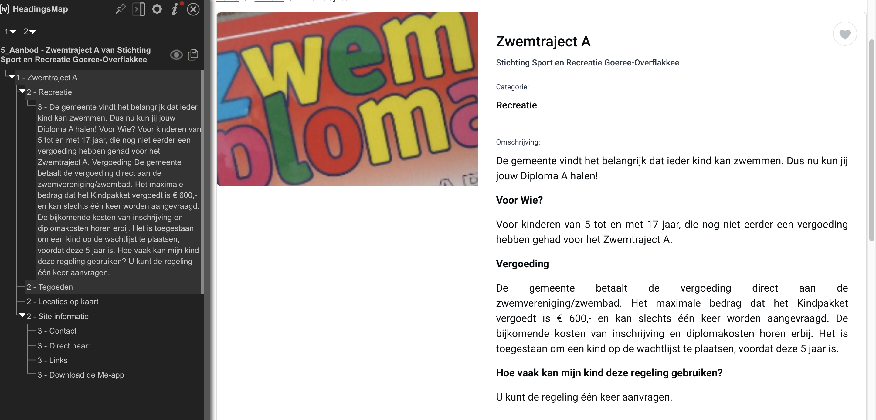
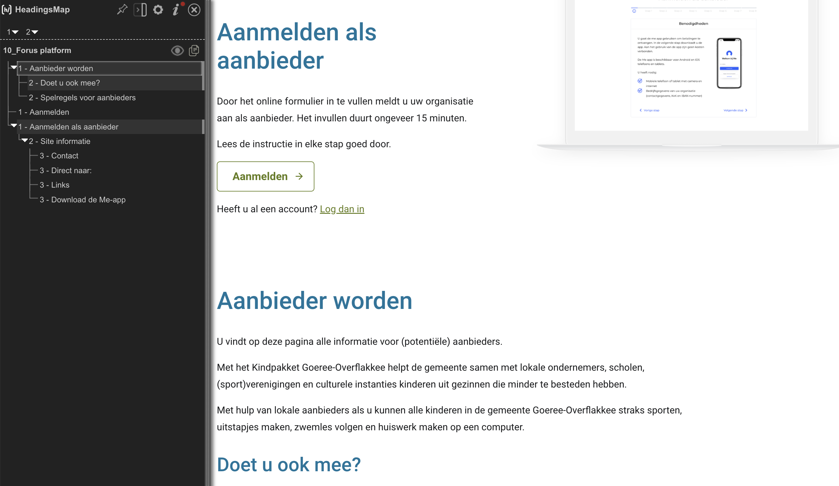
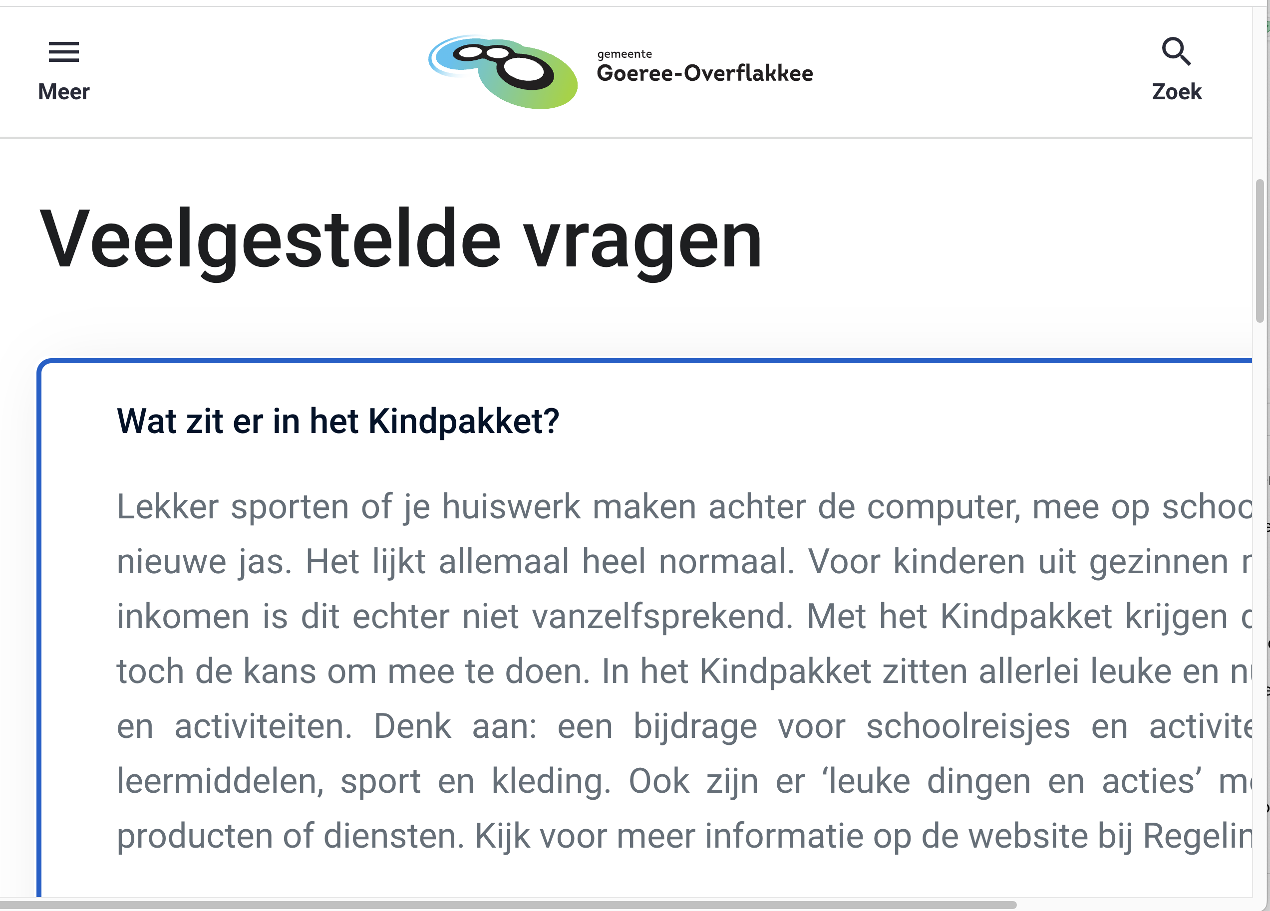
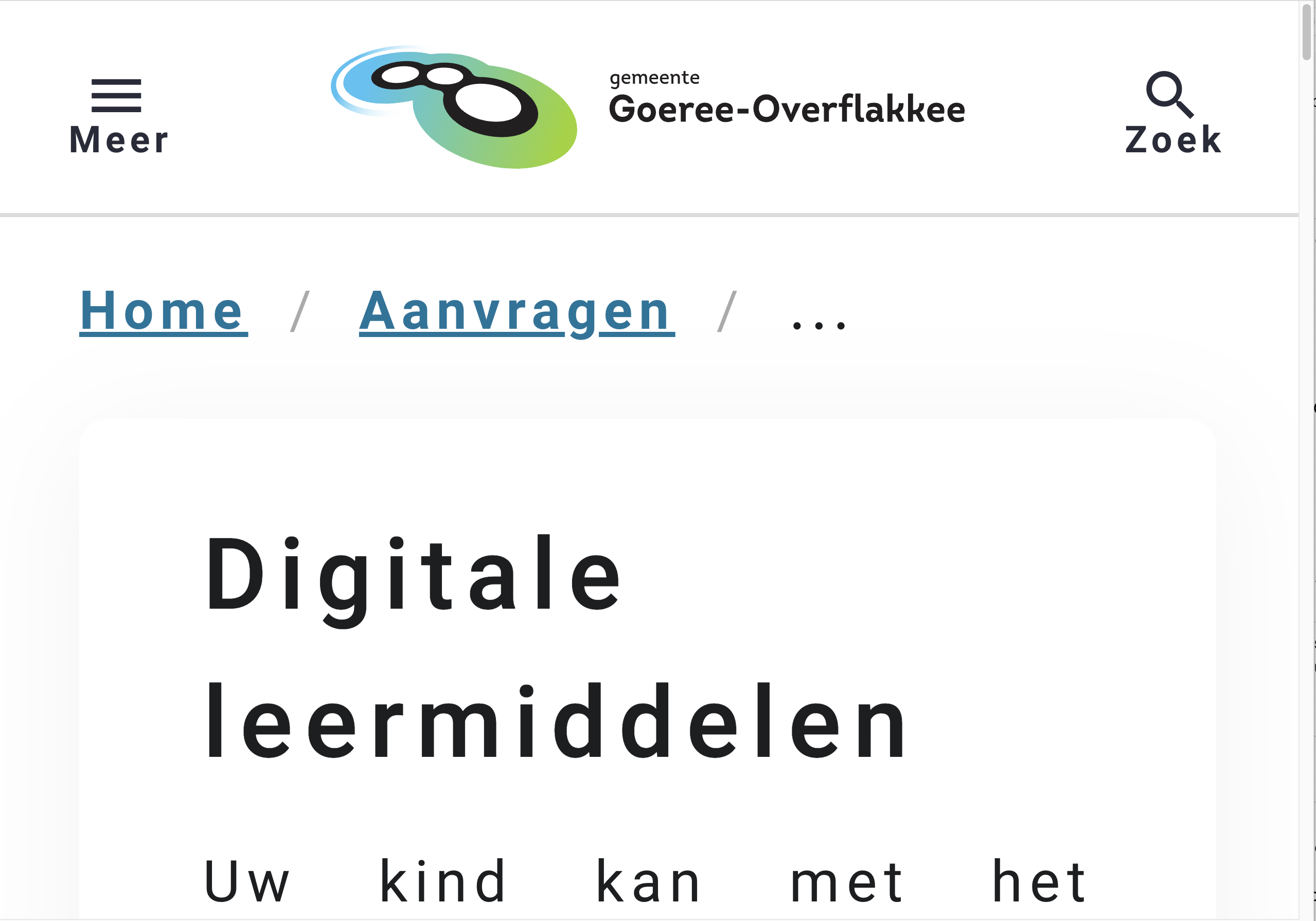
| 1.3.1: Info en relaties | Hele sampleUitkomst: Onvoldoende homepageUitkomst: Onvoldoende regelingenUitkomst: Onvoldoende regeling digitale leermiddelenUitkomst: Onvoldoende aanbodUitkomst: Onvoldoende aanbod product Zwemtraject AUitkomst: Onvoldoende uitlegUitkomst: Onvoldoende zoekresultaten ‘onderwijs’Uitkomst: Onvoldoende aanmelden als aanbieder (proces)Uitkomst: Onvoldoende declaraties (kosten terugvragen)Uitkomst: Onvoldoende random pagina 1 - status aanvraag (via aanvragen)Uitkomst: Onvoldoende | Hele sampleBevindingen: When you choose in the user menu 'Log in to the app', a popup will open. This contains input fields without a label and with invalid aria attributes. This makes it unclear what needs to be filled in where. Solution: add a descriptive label to all input fields (for example ‘nummer 1’). Group them in a fieldset with a legend. The instruction ‘Vul de zes cijfers die in uw app verschijnen hieronder in’ can be put in the legend element. homepageThere is no proper heading hierarchy on the page. Some tags are formatted as h2 headers (for example 'hulp') when they are not actually headers, and some headers have incorrect levels, such as the headers above the offers. Solution: Remove the header formatting from the tags and set the headers for the offers to h3 level." This issue occurs on several pages, for example on ‘aanbieder Sport4AllGO’ where the ‘Aanbod’ heading and the offer headings both are on h2 level. regelingenIn the main navigation the current item is displayed in a different style. This is not communicated to assistive software. Solution: add a ‘aria-current=”page” attribute to the active item. regeling digitale leermiddelenIn the breadcrumb the current page (displayed in bold) is marked up as aria-current=”location”. This is not a suitable value in a breadcrumb navigation. Solution: use “page” instead of location. See also https://www.w3.org/TR/wai-aria-1.1/#aria-current. aanbodAbove the filters, there are 2 buttons, 'volledig aanbod' and 'mijn verlanglijstje'. The first button is green when the page loads, indicating that it is active. This information is not communicated to assistive software. Solution: Assign the active button an aria-pressed="true" attribute. Above the list, on the top right, there is an input field for sorting. However, the label 'sorteer' is not linked to the input (listbox), causing it not to be read by screen readers." Solution: link the button to the ‘sorteer’ label by means of an id. Note: the ‘aria-labelledby’ attribute can take multiple id’s. This issue also occurs on the ‘Aanbieders’ page. aanbod product Zwemtraject AThere is no proper heading hierarchy on the page. The category tag ‘recreatie’ is formatted as a h2 heading. After this, there are 4 paragraphs and subheadings marked up as one h3 heading. Solution: Remove the header formatting from the tag and the paragraphs, and assign h3 header markup to the subheadings (the bold text). See screenshot 2. uitlegThere is no proper heading hierarchy on the page. All the subheadings don’t have heading markup, causing them not to show up in headings lists of assistive software. Solution: mark up all the texts in strong-tags in heading elements on the appropiate level, also within the faq-sections. ‘Veelgestelde vragen’ is formatted on h1-level, but h2 is more appropiate. The questions can be marked up as headings as well. zoekresultaten ‘onderwijs’The heading ‘5 Zoekresultaten gevonden voor onderwijs’ is not marked up as a heading, causing it not to show up in headings lists of assistive software. Solution: Code this heading as a h1 element. aanmelden als aanbieder (proces)There is no proper heading hierarchy on the page. There are 3 headings on h1-level and the visual order is different from the order in the code. This makes it hard to navigate by headings. See screenshot 4. Solution: use for example the following setup:
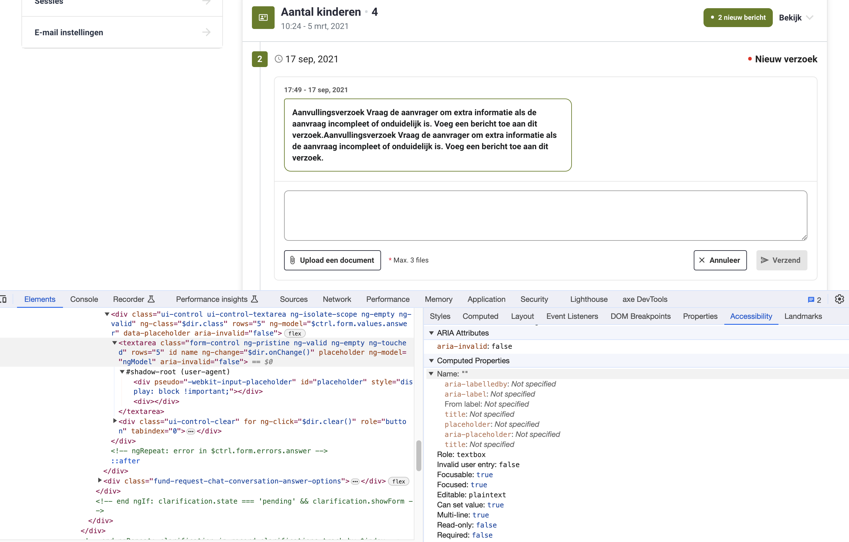
On the sign up page at the top are the steps visible. The current step is only displayed in color. For assisitive software this information is not available. Solution: add aria-current=”step” to the current step. On the organisation form in step 2 are three checkboxes with the same content ‘Toon openbaar on website’. In the layout you can see which checkbox belongs to which input field. For assisitive software this information is not available. Solution: make unique label text for each checkbox. There are visible headings which are not marked up as heading element, for example ‘Benodigdheden’ in step 1. Solution: mark up all visible headings in a heading element on the appropiate level. The input field for the e-mail adress in step 1 is not linked to a label. A placeholder attribute is not sufficient because it’s not always available. The same issue occurs in step 2 in the form at the fields to enter company details. Solution: link the input field to the label by means of an id. declaraties (kosten terugvragen)You can upload a document under 'Nieuws kosten terugvragen’. When you do this, a popup will open titled 'Verplaats en wijzig grootte’. This title is not marked up as a heading. Solution: put the title in a heading element. random pagina 1 - status aanvraag (via aanvragen)There is no proper heading hierarchy on the page. The h1 is missing, and the first heading is a h3 (‘Status aanvraagGeaccepteerd’). Solution: put the heading of the application in a h1 (‘Aanvraag #150’), and put ‘Status aanvraag’ in a h2 element. It’s recommended to put the name/value pairs below ‘Status aanvraag’ in a table or definition list, so that the structure is also clear to users of assistive software. Similar issues occur on the detail page of a declaration. The input field to reply to the message doesn’t have a label. See screenshot 5. Solution: add a label element and link the label by means of an id to the textarea. |
| 1.3.2: Betekenisvolle volgorde | Hele sampleUitkomst: Onvoldoende homepageUitkomst: Onvoldoende | homepageAbove the offers are tags placed in a h2-element, which is not appropiate (see 1.3.1). When this is resolved, the tags should be placed in order after the heading they belong to. So visually they can appear above the heading, but semantically they should appear below the heading, so that screenreader users who navigate by heading are not confused about the meaning of the tags where they belong to. Solution: put the tags in the HTML after the corresponding h2 and show them above the heading by adapting the CSS. |
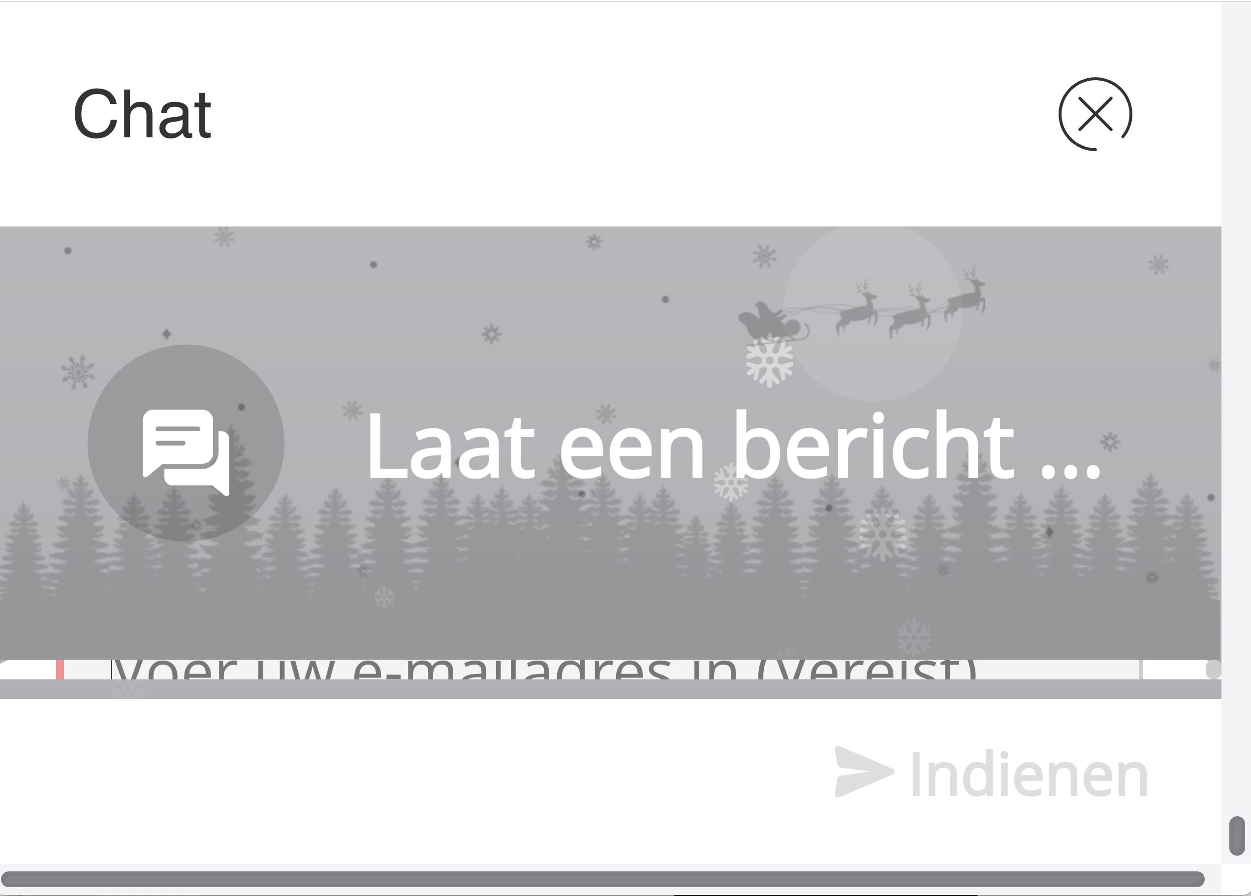
| 1.3.3: Zintuiglijke eigenschappen | Hele sampleUitkomst: Onvoldoende aanmelden als aanbieder (proces)Uitkomst: Onvoldoende | aanmelden als aanbieder (proces)In the text on the sign up page are several referrals to sensory information like ‘rechts bovenin’ of ‘rechtsonder’. Not all users are able to understand these instructions. Solution: refer to textual information like ‘use the link ‘inloggen’ or ‘press the button ‘open chat’. Make sure these elements have the correct accessible name. See also 4.1.2 |
| 1.3.4: Weergavestand | Hele sampleUitkomst: Voldoende | |
| 1.3.5: Identificeer het doel van de input | Hele sampleUitkomst: Onvoldoende aanmelden als aanbieder (proces)Uitkomst: Onvoldoende inloggenUitkomst: Onvoldoende | aanmelden als aanbieder (proces)None of the input fields for personal information like (company) name, adress or phonenumber have a mechanism to autocomplete the input. Solution: This can be improved by placing 'autocomplete' attributes at the input fields. For more information see https://www.w3.org/WAI/WCAG21/Techniques/html/H98 and for a list of all attributes https://www.w3.org/TR/WCAG21/#input-purposes. inloggenThe input field for the e-mail address does not have a mechanism to autocomplete the input. This makes filling out forms easier for many users, for example for people for whom entering text takes a lot of time because it is done via special tools, or for people with cognitive disabilities. In this case the e-mail adress is even more important, because it is has to be filled in repeatedly to log in. Solution: This can be improved by placing an 'autocomplete' attribute at the input field. For more information see https://www.w3.org/WAI/WCAG21/Techniques/html/H98 and for a list of all attributes https://www.w3.org/TR/WCAG21/#input-purposes. This issue applies to all personal input fields on the site, for example when applying for reclaiming of costs. |
1.4 Onderscheidbaar
| Success Criterium | Uitkomst | Bevindingen |
|---|---|---|
| 1.4.1: Gebruik van kleur | Hele sampleUitkomst: Onvoldoende aanbodUitkomst: Onvoldoende | aanbodWhen items are put on the wishlist, it shows with a different color, red instead of gray. There is no other visual clue than color to make this clear, and the contrast between both colors is less than 3:0. Users who are visually impaired or colorblind can have difficulties to see the difference. Solution: provide an extra clue apart from color, like an outline, to show the difference. |
| 1.4.2: Geluidsbediening | Hele sampleUitkomst: Niet van toepassing | |
| 1.4.3: Contrast (minimum) | Hele sampleUitkomst: Onvoldoende homepageUitkomst: Onvoldoende aanmelden als aanbieder (proces)Uitkomst: Onvoldoende random pagina 1 - status aanvraag (via aanvragen)Uitkomst: Onvoldoende | Hele sampleBevindingen: Text must have a contrast of at least 4.5:1 for visually impaired and color blind people. This also applies to active elements such as hover and focus. A number of elements on the website are below these values in terms of contrast. homepageThe titles of the offers (4.3:1), eg. ‘Vrijwillige ouderbijdrage 1 kind’. This issue occurs on several pages. aanmelden als aanbieder (proces)On the sign up page are a lot of elements with low contrast. Some examples:
random pagina 1 - status aanvraag (via aanvragen)The text ‘geaccepteerd’ (black on green, 3.9:1). This also occurs on the page ‘Email instellingen’. |
| 1.4.4: Herschalen van tekst | Hele sampleUitkomst: Onvoldoende aanbieder Sport4AllGOUitkomst: Onvoldoende aanmelden als aanbieder (proces)Uitkomst: Onvoldoende | Hele sampleBevindingen: Make the layout responsive in such a way that all content remains available to at least 200% when zooming in. This is not the case in a number of places on the site. aanbieder Sport4AllGOThe links below in the map like ‘sneltoetsen’ become invisible during zooming, because they fall behind the white background of the main content. Solution: put the content below the map, without overlapping. aanmelden als aanbieder (proces)On the sign up page the <meta> tag disables zooming on mobile devices. |
| 1.4.5: Afbeeldingen van tekst | Hele sampleUitkomst: Voldoende | |
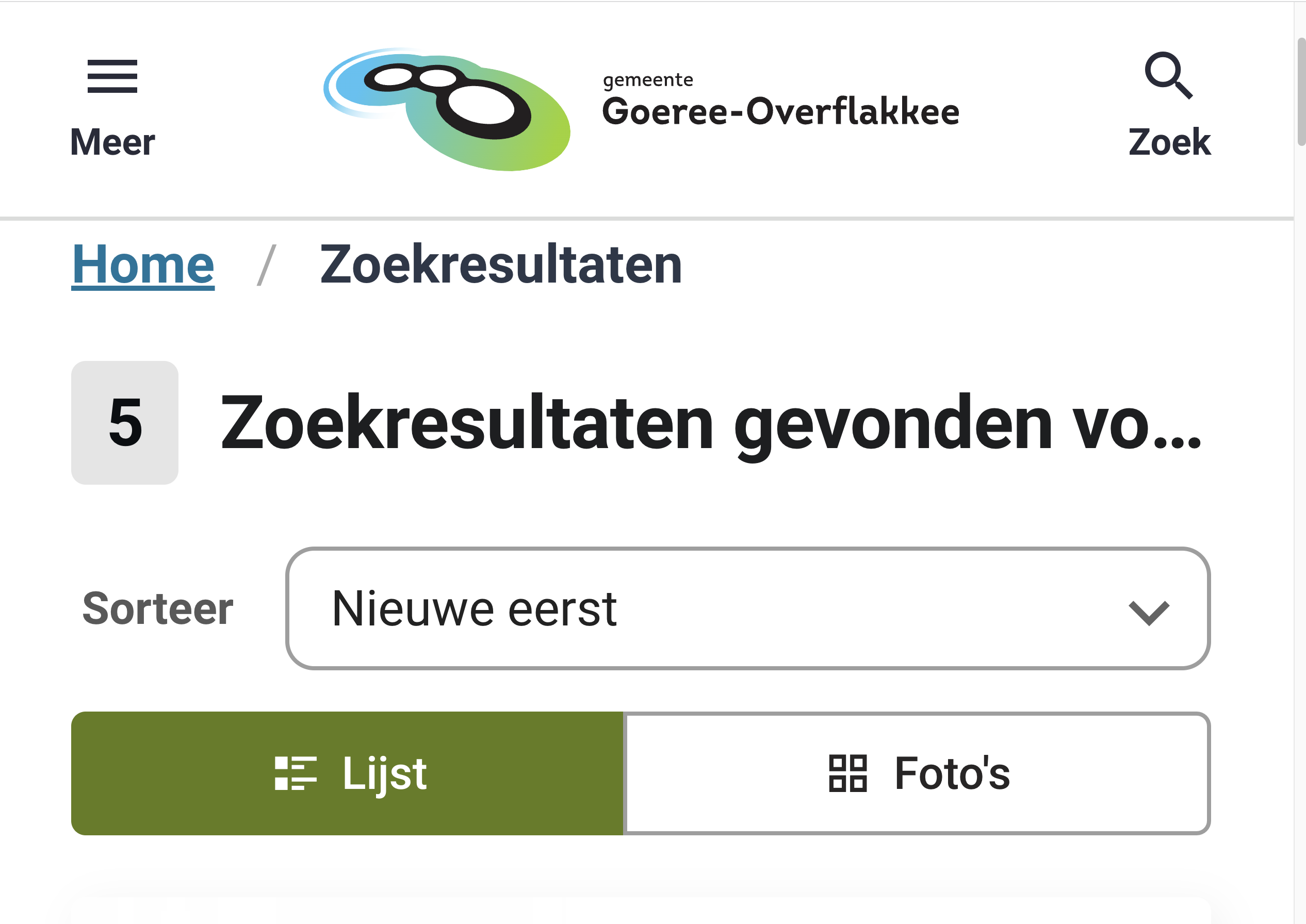
| 1.4.10: Reflow | Hele sampleUitkomst: Onvoldoende uitlegUitkomst: Onvoldoende zoekresultaten ‘onderwijs’Uitkomst: Onvoldoende aanmelden als aanbieder (proces)Uitkomst: Onvoldoende declaraties (kosten terugvragen)Uitkomst: Onvoldoende | Hele sampleBevindingen: Make the layout responsive in such a way that content can be presented without loss of information or functionality, and without requiring scrolling in two dimensions when zooming in to a minimum of 400% (comparable to 320px wide). This is not the case in a number of places on the site. (Tested at 1280px wide.) uitlegAbove 200% the content in the faq needs horizontal scrolling. See screenshot 9. zoekresultaten ‘onderwijs’At 400% the title get’s partly obscured. See screenshot 10. aanmelden als aanbieder (proces)At 400% it’s impossible to use the chat. The input fields are hidden by the title. See screenshot 13. declaraties (kosten terugvragen)At 400% you need to scroll horizontally to read all content. This also is true for the text in the tooltip. See screenshot 12. This issue occurs on several pages, for example the e-mailadress on the page 'Tegoed kledingpakket' and the text ‘Hoofd e-mailadres’ at the page 'Emailinstellingen'. |
| 1.4.11: Contrast van niet-tekstuele content | Hele sampleUitkomst: Onvoldoende homepageUitkomst: Onvoldoende zoekresultaten ‘onderwijs’Uitkomst: Onvoldoende declaraties (kosten terugvragen)Uitkomst: Onvoldoende random pagina 1 - status aanvraag (via aanvragen)Uitkomst: Onvoldoende | Hele sampleBevindingen: Graphic elements must have a contrast of at least 3:1. This also applies to the borders or background color of input fields. A number of elements on the website are below these values in terms of contrast. homepageThe favorite-icons (1.8:1 and 1.6:1 at hover). zoekresultaten ‘onderwijs’The borders of the checkboxes (lightgray, 1.5:1). This checkbox also occurs in the popup to share a QR-code. Recommended: give these borders the same color as the select inputs below (dark gray/black). declaraties (kosten terugvragen)The borders of the input fields in the form to reclaim costs (lightgray, 1.3:1). random pagina 1 - status aanvraag (via aanvragen)The button to delete the input text (lightgray/white, 1.5:1). See screenshot 6. On focus the button dissapears in total. |
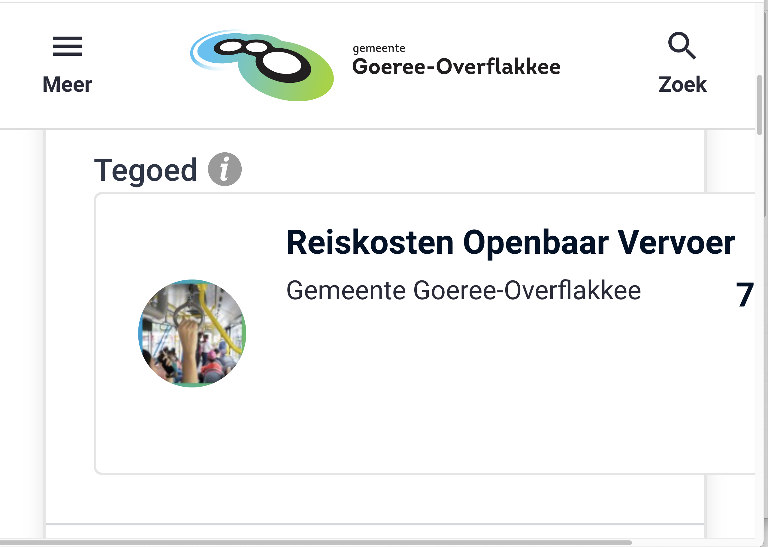
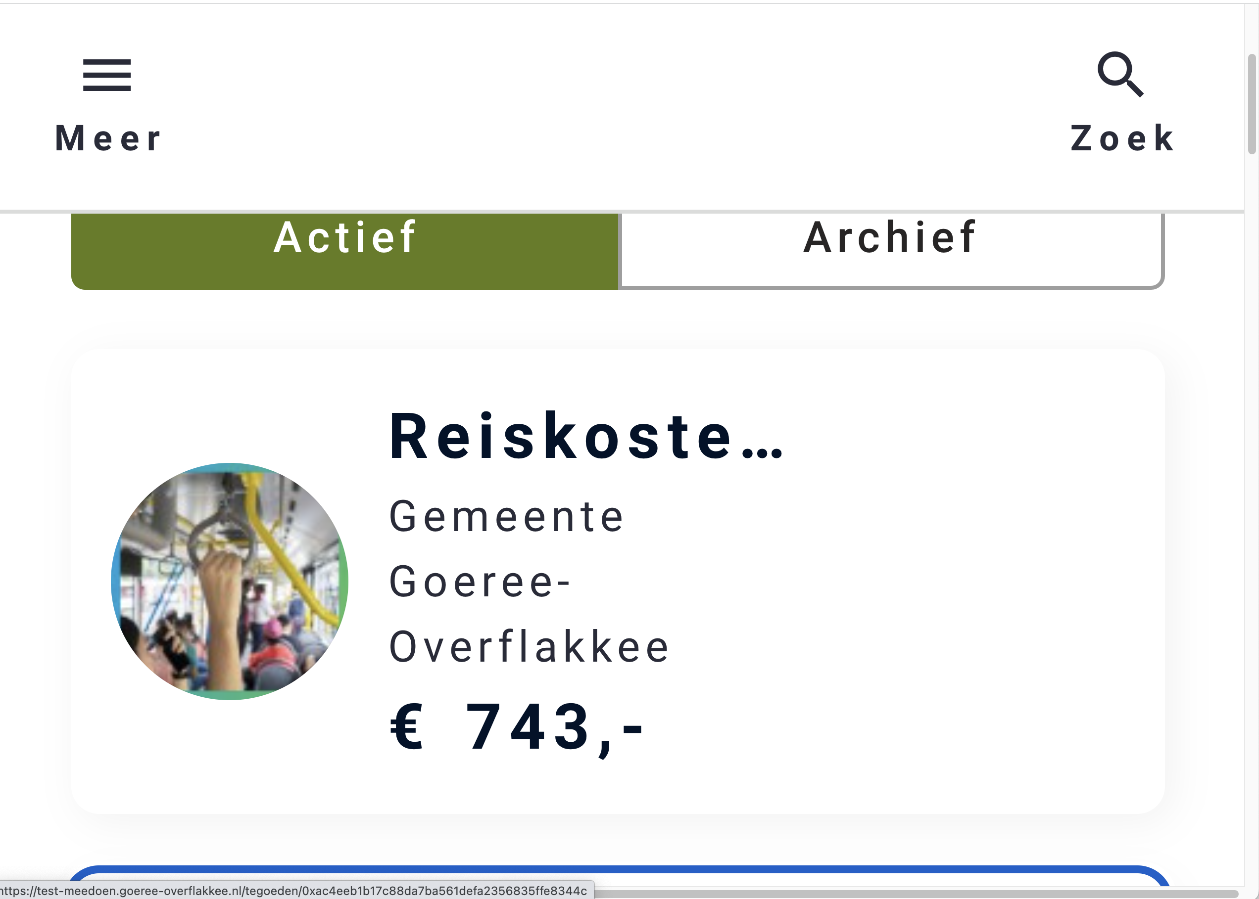
| 1.4.12: Tekstafstand | Hele sampleUitkomst: Onvoldoende regeling digitale leermiddelenUitkomst: Voldoende mijn tegoedenUitkomst: Onvoldoende | Hele sampleBevindingen: When text spacing settings are adjusted for readability (such as line height, letter or word spacing) some content is no longer available. This can be solved by letting containers grow in the layout during text-resizing. You can easily test this criterion with this bookmarklet: https://dylanb.github.io/bookmarklets.html. regeling digitale leermiddelenRemark: at 400% the last item in the breadcrumb navigation gets obscured. See screenshot 14. Solution: show the breadcrumbs on multiple lines (preferable) or show the links in between as dots, like commonly done in pagination. mijn tegoedenFrom 300% zoom content within the credits get obscured by dots. See screenshot 15. Solution: the text container currently has a fixed width (101px). Instead, let the containers grow in the layout during text-resizing, so alle content remains available. |
| 1.4.13: Content bij hover of focus | Hele sampleUitkomst: Onvoldoende aanmelden als aanbieder (proces)Uitkomst: Onvoldoende | aanmelden als aanbieder (proces)On the signup page, the popup which appears on hovering the question mark can only be closed by moving the mouse. People using magnification software must move the mouse to view parts of the page. If content falls over something (unintentionally), they must be able to remove it with the keyboard. Solution: Make it possible to close the popup with the escape key. |
2 Bedienbaar
2.1 Toetsenbordtoegankelijk
| Success Criterium | Uitkomst | Bevindingen |
|---|---|---|
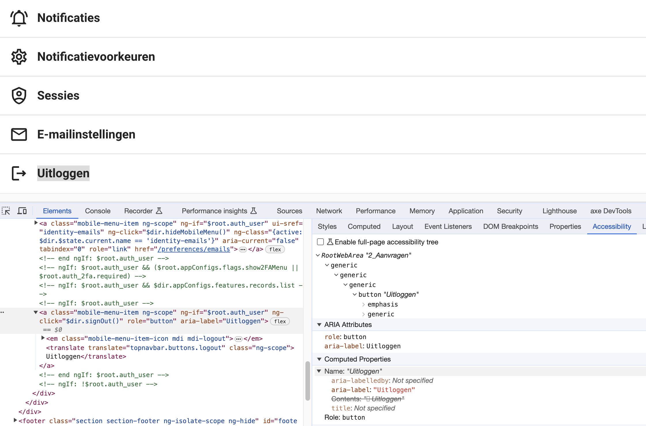
| 2.1.1: Toetsenbord | Hele sampleUitkomst: Onvoldoende aanmelden als aanbieder (proces)Uitkomst: Onvoldoende | Hele sampleBevindingen: When zoomed in above 150%, the ‘uitloggen’ button at the end of the menu doesn’t work with keyboard. See screenshot 8. Solution: it’s a link element with a ARIA role of button. Code it as a native button element, so it will be accessible by default. Otherwise, add the necessary functionality to make it work by keyboard. aanmelden als aanbieder (proces)On the sign up page it’s not possible to start the process by keyboard. Only the link to leave the form is keyboard accessible. Solution: make sure alle interactive elements in the form are accessible by keyboard, like link elements with href attribute and (native) button elements and form fields. Also tooltips (step 2) and the chat must be keyboard accessible. |
| 2.1.2: Geen toetsenbordval | Hele sampleUitkomst: Voldoende | |
| 2.1.4: Enkel teken sneltoetsen | Hele sampleUitkomst: Niet van toepassing |
2.2 Genoeg tijd
| Success Criterium | Uitkomst | Bevindingen |
|---|---|---|
| 2.2.1: Timing aanpasbaar | Hele sampleUitkomst: Onvoldoende homepageUitkomst: Onvoldoende | homepageWhen you are logged in, the offers will have buttons with a heart. When you activate this, a message will appear briefly with a link on the bottom of the page. This message disappears after a few seconds, and cannot be extended or shown again. Solution: Ensure that the message remains on screen until the user clicks it away. Also make sure it can be used with keyboard. (This could not be tested, beause it was gone before reaching it by keyboard.) |
| 2.2.2: Pauzeren, stoppen, verbergen | Hele sampleUitkomst: Niet van toepassing |
2.3 Toevallen en fysieke reacties
| Success Criterium | Uitkomst | Bevindingen |
|---|---|---|
| 2.3.1: Drie flitsen of beneden drempelwaarde | Hele sampleUitkomst: Voldoende |
2.4 Navigeerbaar
| Success Criterium | Uitkomst | Bevindingen |
|---|---|---|
| 2.4.1: Blokken omzeilen | Hele sampleUitkomst: Onvoldoende mijn tegoedenUitkomst: Onvoldoende | Hele sampleBevindingen: There is a skiplink present, but the link doesn’t work in all browsers and at all times. During testing, it didn’t work on most pages while using NVDA (Edge) or VoiceOver (Safari). Solution: Make sure the target of the skiplink is always present on the page (loaded in time) and can receive focus. mijn tegoedenWhen zoomed in above 150%, the skiplink is not visible when focused. It’s probably obscured by a header element. Solution: put the skiplink in layers on top of the header elements. When logged in, the skiplink does not take you to the main content, but to the (secondary) navigation. This navigation is a long list, which is being repeated on every page. Solution: make it possible to jump also over the secondary navigation items. Put the skiplink id after all the navigation, or provide a extra skiplink to jump over the secondary navigation. |
| 2.4.2: Paginatitel | Hele sampleUitkomst: Onvoldoende aanbod product Zwemtraject AUitkomst: Onvoldoende | aanbod product Zwemtraject AThe page doesn’t have a descriptive title. The page title is ‘Aanbod - van’. This occurs on several pages. There are also page titles like ‘Forus platform’ (Aanmelden als aanbieder, Tegoeden) and ‘Goereeoverflakkee’ (status aanvraag) . Also the pagetitles ‘Zoekresultaten for search results’ and ‘Uw tegoed - 0xac4eeb1b17c88da7ba561defa2356835ffe8344c’ can be improved. Solution: make sure every page has a descriptive, unique title. |
| 2.4.3: Focus volgorde | Hele sampleUitkomst: Onvoldoende declaraties (kosten terugvragen)Uitkomst: Onvoldoende | declaraties (kosten terugvragen)When you have uploaded a document and want to proceed to the next field in the form, focus is placed on top of the page. This means you have to navigate again (without working skiplink if you use a screenreader) through the whole page to the relevant place in the form. Solution: set the focus to the last used or the next input field in the form after selecting an option or adding a upload. Remark: setting the focus to the last used or next input field is also recommended behavior after selecting a filter on for example the Aanbieders page. Currently, after selecting a filter, for example Categorie, the focus is placed back at the top of the page while the page itself (apart from the list with results) doesn’t seem to have changed. This makes it hard to select more filters or go to the results. |
| 2.4.4: Linkdoel (in context) | Hele sampleUitkomst: Voldoende | |
| 2.4.5: Meerdere manieren | Hele sampleUitkomst: Voldoende | |
| 2.4.6: Koppen en labels | Hele sampleUitkomst: Onvoldoende regelingenUitkomst: Onvoldoende aanbodUitkomst: Onvoldoende | regelingenThe title for this section in the main navigation is ‘Regelingen’, but the title on the page itself is ‘Aanvragen’. This can be confusing for users. Solution: be consistent in the naming of sections, keep it ‘Aanvragen’ everywhere or ‘Regelingen’ everywhere. aanbodThe label for the input field to search within the filters is named 'search.' However, this is a Dutch-language page, and English words may not be understandable to everyone. Solution: Change the label to Dutch. |
| 2.4.7: Focus zichtbaar | Hele sampleUitkomst: Onvoldoende notificatiesUitkomst: Onvoldoende | notificatiesThe focus on the pagination links is not visible. Solution: apply the hover style to the focus state as well, or apply a different focus style like an outline. |
2.5 Input Modaliteiten
| Success Criterium | Uitkomst | Bevindingen |
|---|---|---|
| 2.5.1: Aanwijzergebaren | Hele sampleUitkomst: Niet van toepassing | |
| 2.5.2: Aanwijzerannulering | Hele sampleUitkomst: Voldoende | |
| 2.5.3: Label in naam | Hele sampleUitkomst: Onvoldoende | Hele sampleBevindingen: When your are zoomed in for 150% or more, the link behind the logo has a different accessible name than the visible name. Visible is ‘Gemeente Goeree-Overflakkee’ and the accesible name (for assistive software) is ‘Terug naar hoofdpagina’. This can be problematic for voice control users. Solution: inlude the visible text in the alt-text. See also 1.1.1. |
| 2.5.4: Bewegingsactivering | Hele sampleUitkomst: Niet van toepassing |
3 Begrijpelijk
3.1 Leesbaar
| Success Criterium | Uitkomst | Bevindingen |
|---|---|---|
| 3.1.1: Taal van de pagina | Hele sampleUitkomst: Voldoende | |
| 3.1.2: Taal van onderdelen | Hele sampleUitkomst: Niet van toepassing |
3.2 Voorspelbaar
| Success Criterium | Uitkomst | Bevindingen |
|---|---|---|
| 3.2.1: Bij focus | Hele sampleUitkomst: Voldoende | |
| 3.2.2: Bij input | Hele sampleUitkomst: Onvoldoende aanmelden als aanbieder (proces)Uitkomst: Onvoldoende | aanmelden als aanbieder (proces)On the sign up page at https://staging.forus.io/provider/#!/sign-up at step 2 you have to enter a company address. After selecting an address from the list, the page automatically refreshes and takes you to the next step. This is unexpected behavior after input, and in this case also strange because there were more fields to be filled in below the address field. Solution: don’t submit after selecting an option, but only at the end of the form at ‘vestiging opslaan’. |
| 3.2.3: Consistente navigatie | Hele sampleUitkomst: Voldoende | |
| 3.2.4: Consistente identificatie | Hele sampleUitkomst: Voldoende |
3.3 Assistentie bij invoer
| Success Criterium | Uitkomst | Bevindingen |
|---|---|---|
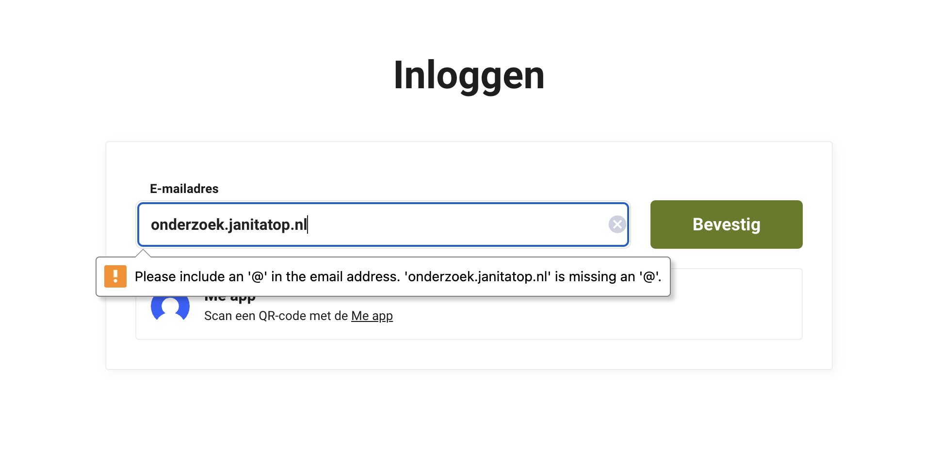
| 3.3.1: Foutidentificatie | Hele sampleUitkomst: Onvoldoende aanmelden als aanbieder (proces)Uitkomst: Onvoldoende inloggenUitkomst: Onvoldoende declaraties (kosten terugvragen)Uitkomst: Onvoldoende | aanmelden als aanbieder (proces)When submitting the company information form (step) is not possible, there is no clear explanation what went wrong. To state that fields are required is not a error identication but an instruction (which is recommended to state to the user before submitting). Solution: a good error identication can be for example ‘het e-mailadres is verplicht maar nog niet ingevuld’. It’s also recommended to put a general error mesage at the top of the form to make it clear there were errors to be corrected. inloggenWhen the form can’t be sumbitted, the error is displayed in a (browser-dependent) English tooltip. This may not be clear to every user. See screenshot 16. Solution: provide a Dutch error message in text, independent of the browser. declaraties (kosten terugvragen)When the form for reclaiming costs can’t be submitted, there is no clear explanation what went wrong. To state that fields are required is not a error identication but an instruction (which is recommended to state to the user before submitting). Also, the error texts are partly in English (‘Het title veld is verplicht.’). Solution: a good error identication can be for example ‘het IBAN-nummer is verplicht maar nog niet ingevuld’. It’s also recommended to put a general error mesage at the top of the form. There is a general notification, but it dissapears after a few seconds. Put all errors in the language of the page (Dutch in this case). Remark: the bank account name is required to be at least 5 characters. This is not always the case, like my name (‘Top’). Also for example Chinese names are often shorter then 5 characters. |
| 3.3.2: Labels of instructies | Hele sampleUitkomst: Onvoldoende aanmelden als aanbieder (proces)Uitkomst: Onvoldoende declaraties (kosten terugvragen)Uitkomst: Onvoldoende | aanmelden als aanbieder (proces)There are no instructions on required fields and specific formats like IBAN number or KVK number before submitting the form. This can prevent errors, (repeated) resubmitting or leaving the form before completion. Solution: provide instructions on required fields and specific formats in text near each relevant input field. declaraties (kosten terugvragen)There are no instructions on required fields and specific formats like IBAN number before submitting the form. This can prevent errors, (repeated) resubmitting or leaving the form before completion. Solution: provide instructions on required fields and specific formats in text near each relevant input field. |
| 3.3.3: Foutsuggestie | Hele sampleUitkomst: Onvoldoende declaraties (kosten terugvragen)Uitkomst: Onvoldoende | declaraties (kosten terugvragen)The input field for the IBAN number requires a specific format. This is not suggested to the user, only a general error message ‘it must be valid’. This issue also occurs at several places in the page Aanmelden als aanbieder. Solution: assist the user by explaining the required format and providing an example. |
| 3.3.4: Foutpreventie (wettelijk, financieel, gegevens | Hele sampleUitkomst: Voldoende |
4 Robuust
4.1 Compatibel
| Success Criterium | Uitkomst | Bevindingen |
|---|---|---|
| 4.1.1: Parsen | Hele sampleUitkomst: Voldoende | |
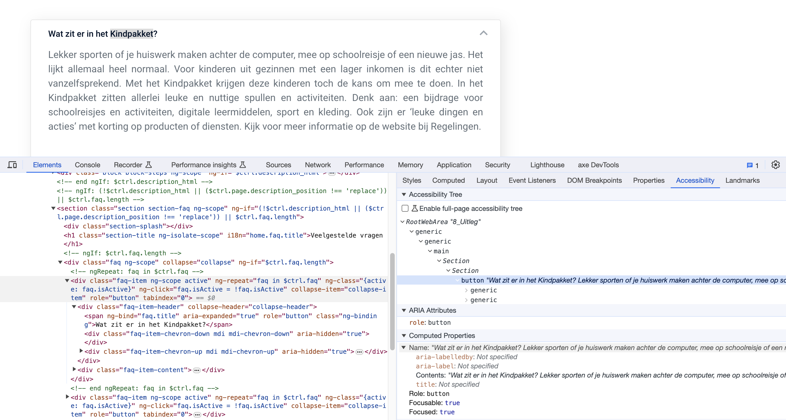
| 4.1.2: Naam, rol, waarde | Hele sampleUitkomst: Onvoldoende homepageUitkomst: Onvoldoende regelingenUitkomst: Onvoldoende aanbiedersUitkomst: Onvoldoende uitlegUitkomst: Onvoldoende aanmelden als aanbieder (proces)Uitkomst: Onvoldoende declaraties (kosten terugvragen)Uitkomst: Onvoldoende notificatiesUitkomst: Onvoldoende random pagina 1 - status aanvraag (via aanvragen)Uitkomst: Onvoldoende | Hele sampleBevindingen: When you enter a word in the search bar, a drop-down menu will appear. It is not clear to assistance software that additional content has been opened. Solution: indicate this extra content for example by adding a aria-haspopup attribute and a suitable role for the content. The buttons such as 'Offer' on the right do not indicate a status (open/closed). Solution: this can be solved using the aria-expanded attribute. The buttons such as 'Offer' on the left work as tabs. However, the status is not clear for assistive software. Solution: indicate this for example by the aria-selected attribute on the active item. When you choose in the user menu 'Log in to the app', a popup will open. Below ‘Stap 3: vul de code in’ is a button without a name. This button is placed around the input fields. Solution: remove the button markup, it’s not needed here. See also 1.3.1. When you're zoomed in from 150%, the main menu items will appear under a button called 'Meer'. This button does not indicate a status (open/closed). Solution: This can be solved using the aria-expanded attribute. When you're zoomed in from 150%, the search input is closed by default. The button to open the input field (‘Zoek’) doesn’t indicate that extra content will be opened. Solution: This can be solved using the aria-expanded attribute on the button. When you're zoomed in from 150% and the search input is opened, there is a close button without a name. Solution: provide a name to the button with text in the button element or by means of a aria-label attribute. In the usermenu: the links to the pages are not correct link elements (with href attribute). This is problematic for screenreader users, because it’s impossible to use the links to navigate to the pages. When a link is activated, the user menu closes again, but you are still on the same page. Solution: use ‘real’ link elements, so they can be used to activate by pressing enter or spacebar. homepageBelow Aanbod: The buttons to favorite an offer are nested in the link of the offer. This is problematic for screenreader users, because it’s impossible to use the link to the offer. When the link is activated, the offer is put on or off the wish list. This should be separate actions. Solution: don’t nest interactive elements. regelingenThe buttons with ‘toon meer’ refer to an aria-controls id (‘fund_description_short’)that is not present on the page. For a screenreader user it’s not clear where the extra content is placed (and that you actually have to go back instead of further down the content). Solution: refer to existing, unique id’s. Also, it’s better to seperate the default from the extra content in different containers, so that it’s clear for screenreader users where the extra content begins. When you are zoomed in to 150% or more, the filter options will appear behind a button. This button does not indicate a status (collapsed or expanded). Solution: This can be solved using the aria-expanded attribute on the button. aanbiedersIn the filter sections are input fields which visually resemble a select with options, but they are buttons that open a list box. The role and operation of this is not clear to users of assistance software. The listbox does not have an accessible name. Input fields are also nested. With the keyboard it does not work as expected with a listbox with the enter key to open the list and the arrow keys to navigate between the options. With the screen reader (tested with VoiceOver in Safari) it is now impossible to select an option. Solution: use the native select element to provide the options. This will be accessible to users of keyboard and assistive software by default. Also make sure that the keyboard focus stays on the last used field or goes to the next field in the form. Currently, after selecting an option, the focus goes to the top of the page. This makes it hard to select multiple filters. This is also true for the sort option. uitlegThe faq-section is not marked up correctly. The button to open the question has a name which consists of the whole content of the section. See screenshot 3. The screenreader reads the total text of the answer and no state (collapsed or not). This is very confusing. Solution: remove the role and tabindex attributes of the div element with class ‘faq-item ng-scope active’. Ensure that only the appropiate button gets focus and is communicated with name and state to assisitive software. aanmelden als aanbieder (proces)On the sign up page the button to start the chat doesn’t have a correct name and role. Solution: code it as a button element with a good description. Just a question mark is not descriptive. Give it a visible label with text and make the accessible label the same, e.g. ‘open chat’. The frame with the chat window doesn’t have an accessible name. Solution: provide a title attribute or an aria-label with a description of the chat function. The button to close the chat window doesn’t have a correct name and role. It’s just a div element with a svg image. Solution: code it as a button element with an appropiate name (in Dutch). In step 2 is a form. The selectbox to select the organisation type does not have a correct role. It is just a div element. Solution: use the native select element or add an appropiate ARIA role, eg. a combobox. The checkboxes doe not present a state. Solution: add an ‘aria-checked’-attribute with true or false. In the dashboard is a link with an icon of a question mark. This link doesn’t have a name. Solution: provide a text within the link element of provide an aria-label describing the purpose of the link. In the dashboard is a button with a bell icon. This button doesn’t have a correct name and role. It’s also not accessible by keyboard. Solution: code the button as a button element with an appropiate name (in Dutch). Also ensure that the state (open/closed) is communicated to assistive software. declaraties (kosten terugvragen)You can upload a document under 'Nieuwe kosten terugvragen’. When you do this, a popup will open titled 'Verplaats en wijzig grootte’. Below the image there are arrow buttons. These buttons have no name. Solution: add a text within the button element or add a aria-label attribute to the buttons. notificatiesWhen zoomed in at 400%, the pagination buttons to go to the first and the last page do not have a name. Solution: the button texts are hidden for assistive software with display:none. Use another CSS technique to hide the text only visually. random pagina 1 - status aanvraag (via aanvragen)Below ‘Mijn gegevens’ is a button to open the messages. The status (expanded or not) is not communicated to assistive software. Solution: add the aria-expanded attribute to the button and show the appropiate value. The input field to reply to the message doesn’t have a name. Solution: add a label element and link the label by means of an id to the textarea. The button in the textarea to remove the input has no name. Solution: add a text within the button element or add a aria-label attribute to the button. |
| 4.1.3: Statusberichten | Hele sampleUitkomst: Onvoldoende aanmelden als aanbieder (proces)Uitkomst: Onvoldoende | aanmelden als aanbieder (proces)On the sign up page at step 2 there is a form to provide company details. When there are automatic errors detected, the fields to be corrected show a red text. These messages are not communicated to assistive software. Solution: consider using role='status' or employing live regions for status messages. For more information, refer to https://www.w3.org/WAI/WCAG21/Understanding/status-messages.html#techniques. |
WCAG 2.2 (extra)
2 Bedienbaar
2.4 Navigeerbaar
| Success Criterium | Uitkomst | Bevindingen |
|---|---|---|
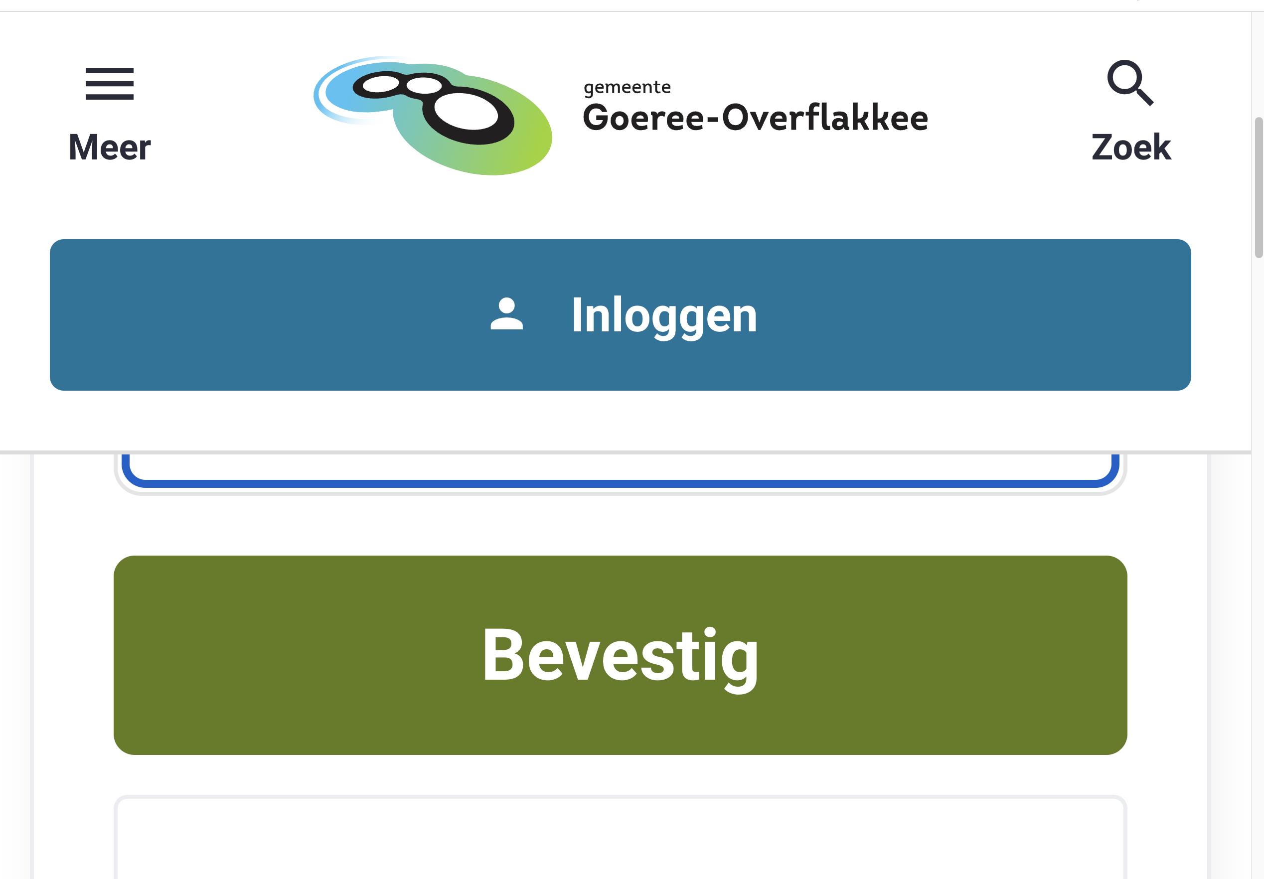
| 2.4.11: Focus Not Obscured (Minimum) (AA) | Hele sampleUitkomst: Onvoldoende regelingenUitkomst: Onvoldoende inloggenUitkomst: Onvoldoende aanbod product Zwemtraject AUitkomst: Onvoldoende aanbieder Sport4AllGOUitkomst: Onvoldoende |
regelingenWhen you are zoomed in at 150% or more and use the skiplink to go to the main content, the focus on the first element (the filter button) is obscured by the ‘inloggen’ link. See screenshot 7. inloggenWhen zoomed in at 400% it’s difficult to log in, because the input field for the email-adress is obscured by the header. See screenshot 11. aanbod product Zwemtraject AWhen zoomed in at 400%, the focus on the ‘favorite’ button is not visible. It’s obscured by the navigation header. This occurs on several pages, also on the homepage. aanbieder Sport4AllGOThe focus on the links below in the map like ‘sneltoetsen’ becomes invisible during zooming, because they fall behind the white background of the main content. |
2.5 Input Modaliteiten
| Success Criterium | Uitkomst | Bevindingen |
|---|---|---|
| 2.5.7: Dragging Movements (AA) | Hele sampleUitkomst: Niet van toepassing |
|
| 2.5.8: Target Size (Minimum) (AA) | Hele sampleUitkomst: Voldoende |
3 Begrijpelijk
3.2 Voorspelbaar
| Success Criterium | Uitkomst | Bevindingen |
|---|---|---|
| 3.2.6: Consistent Help (A) | Hele sampleUitkomst: Voldoende |
3.3 Assistentie bij invoer
| Success Criterium | Uitkomst | Bevindingen |
|---|---|---|
| 3.3.7: Redundant Entry (A) | Hele sampleUitkomst: Voldoende |
|
| 3.3.8: Accessible Authentication (Minimum) (AA) | Hele sampleUitkomst: Voldoende |
Sample met getoetste webpagina's
- homepage - https://test-meedoen.goeree-overflakkee.nl/
- regelingen - https://test-meedoen.goeree-overflakkee.nl/fondsen
- regeling digitale leermiddelen - https://test-meedoen.goeree-overflakkee.nl/fondsen/158
- aanbod - https://test-meedoen.goeree-overflakkee.nl/aanbod
- aanbod product Zwemtraject A - https://test-meedoen.goeree-overflakkee.nl/aanbod/2009
- aanbieders - https://test-meedoen.goeree-overflakkee.nl/aanbieders
- aanbieder Sport4AllGO - https://test-meedoen.goeree-overflakkee.nl/aanbieders/809
- uitleg - https://test-meedoen.goeree-overflakkee.nl/uitleg
- zoekresultaten ‘onderwijs’ - https://test-meedoen.goeree-overflakkee.nl/search?q=onderwijs
- aanmelden als aanbieder (proces) - https://test-meedoen.goeree-overflakkee.nl/aanbieders/aanmelden
- inloggen - https://test-meedoen.goeree-overflakkee.nl/start
- mijn tegoeden - https://test-meedoen.goeree-overflakkee.nl/tegoeden
- tegoed kledingpakket - https://test-meedoen.goeree-overflakkee.nl/tegoeden/0xac4eeb1b17c88da7ba561defa2356835ffe8344c
- verlanglijst - https://test-meedoen.goeree-overflakkee.nl/verlanglijst
- declaraties (kosten terugvragen) - https://test-meedoen.goeree-overflakkee.nl/declaraties
- notificaties - https://test-meedoen.goeree-overflakkee.nl/notifications
- notificatievoorkeuren - https://test-meedoen.goeree-overflakkee.nl/preferences/notifications
- random pagina 1 - status aanvraag (via aanvragen) - https://test-meedoen.goeree-overflakkee.nl/fondsen-aanvraag/150
- random pagina 2 - emailinstellingen - https://test-meedoen.goeree-overflakkee.nl/preferences/emails
Webtechnologie
HTML,CSS,WAI-ARIA,JavaScript,SVG
Onderbouwing van de evaluatie
Gebruikte systemen tijdens het onderzoek:
- Chrome 120 en Safari 17.1.2 met Voiceover op Mac 13.6.1
- Edge 119 op Windows 10
- Chrome 120 op Android 13
Screenshots